Press Pass: Identities Fashion Show


This weekend we were invited to the Identities Fashion Show, Harvard’s preeminent fashion event pairing student catwalk models with renowned designers.  We arrived a few hours before the show started to get a behind the scenes look at its making.  

It’s always interesting to see the nitty gritty details that go behind the polished products we ultimately enjoy.  While neither of us have any real “Fashion Week” experience (hopefully one day!), we liken the backstage process of Identities to be a rather fair representation of runway shows in general: the ubiquity of those anxious minutes before the lights go down, the music turns up, and the first model steps out onto the runway.  People — models, makeup artists, coordinators  run around frantically.  A girl’s shorts are on backwards, another messed with her makeup, “Does my face blend in with my hair?” a friend asks, “Foundation is like sauce for you face” we overhear in the makeup room.

We manage to sneak into some of the quiet rooms backstage and muse through racks of clothing and runway lineups.

While we don’t have ample opportunity to speak with the designers or people behind the show, most express a mix of nervous anticipation and excitement.  One model, who wears a funky 3D piece with arms attached, recalls how at last year's show she wore a bikini with sneakers, so she's feeling a little more relaxed in this year’s less revealing ensemble.

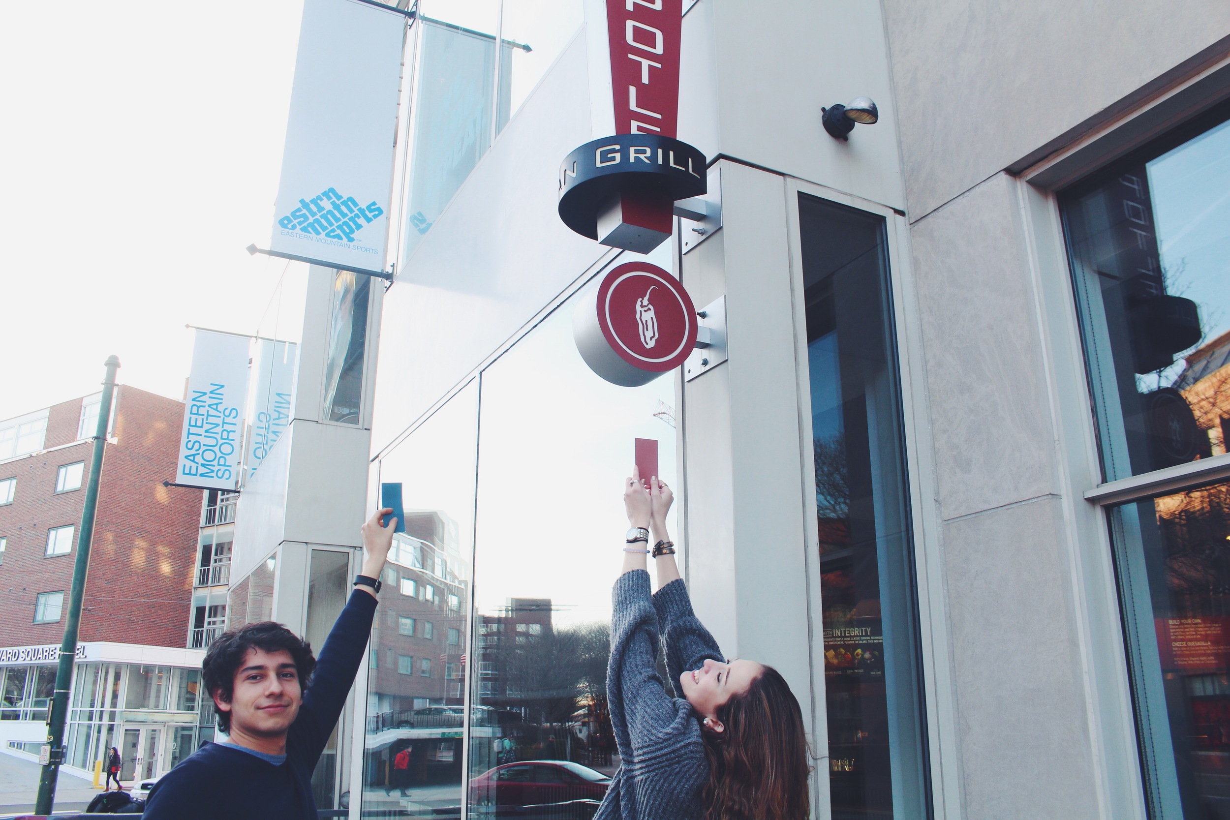
As the final run-through transitions into VIP lounging, red carpet pictures, and general mingling, the room buzzes with enthusiasm.  People gather and dance with friends.  The photo strip and red carpet establish the night's etiquette: shameless selfies and lots of them.  We take the opportunity to immerse ourselves in the pre-show social conventions and snap some Mod & Bean team pics in front of the Identities backdrop.  

We peruse around show-goers and show-coordinators, happen upon a table serving JP Licks ice cream, and meet some of the designers from China Central Academy of Fine Arts.  

Spotting one of the designer's sick street style, we ask to take a picture of her outfit.  She excitedly shares with us that she hand crafted everything she's wearing.  When asked how often she designs for herself, she remarks that she makes around twenty new pieces a month.  Duly impressed and jealous, we dream of being able to curate our own wardrobes with such personal precision.

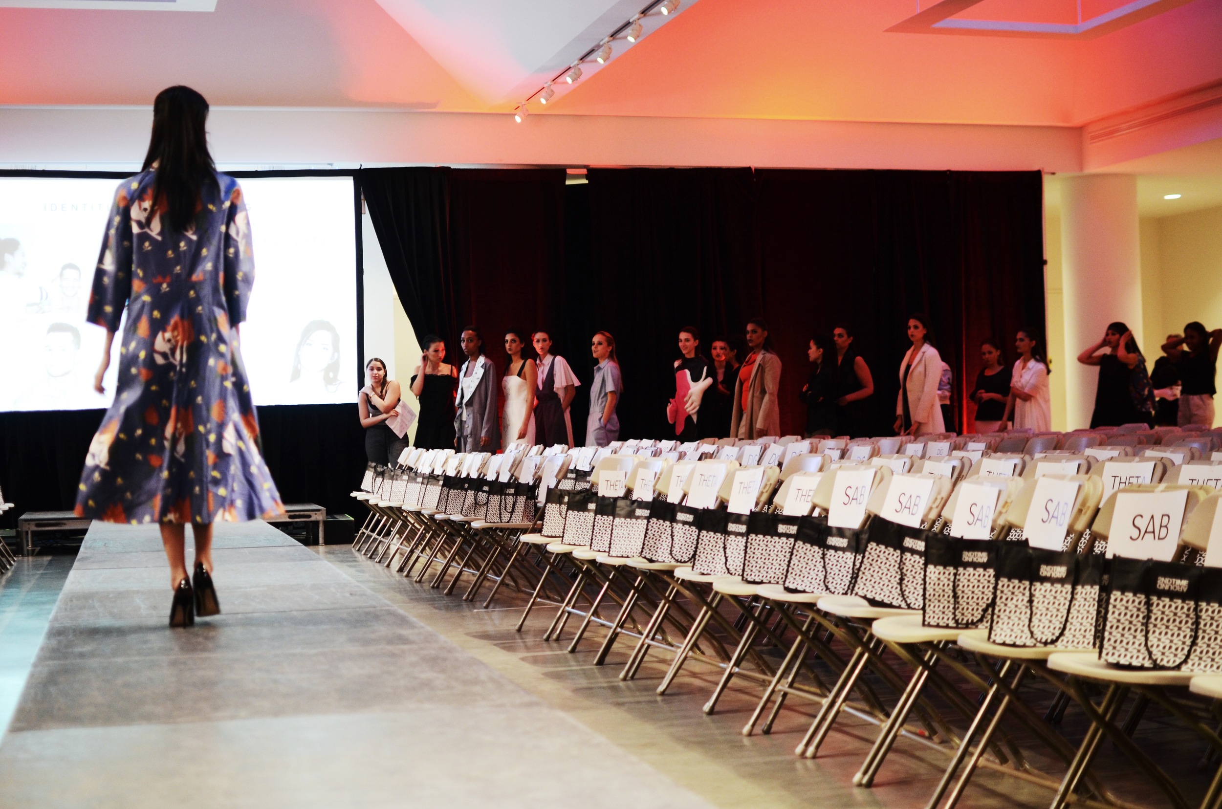
Before we know it, the show begins, we find our seats, and the night gets under way.  Venture below to check out some of our favorite runway and behind the scenes shots:

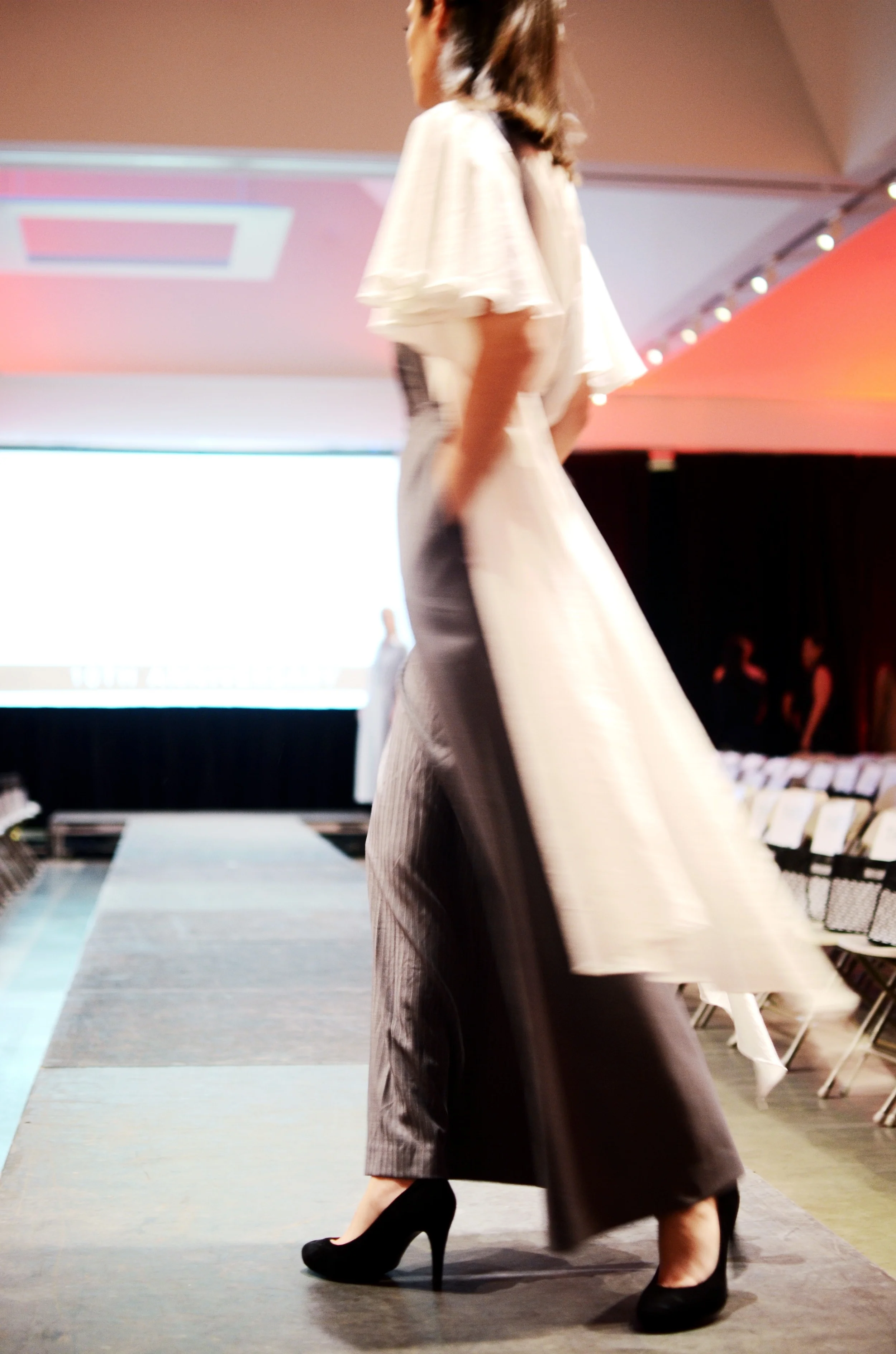
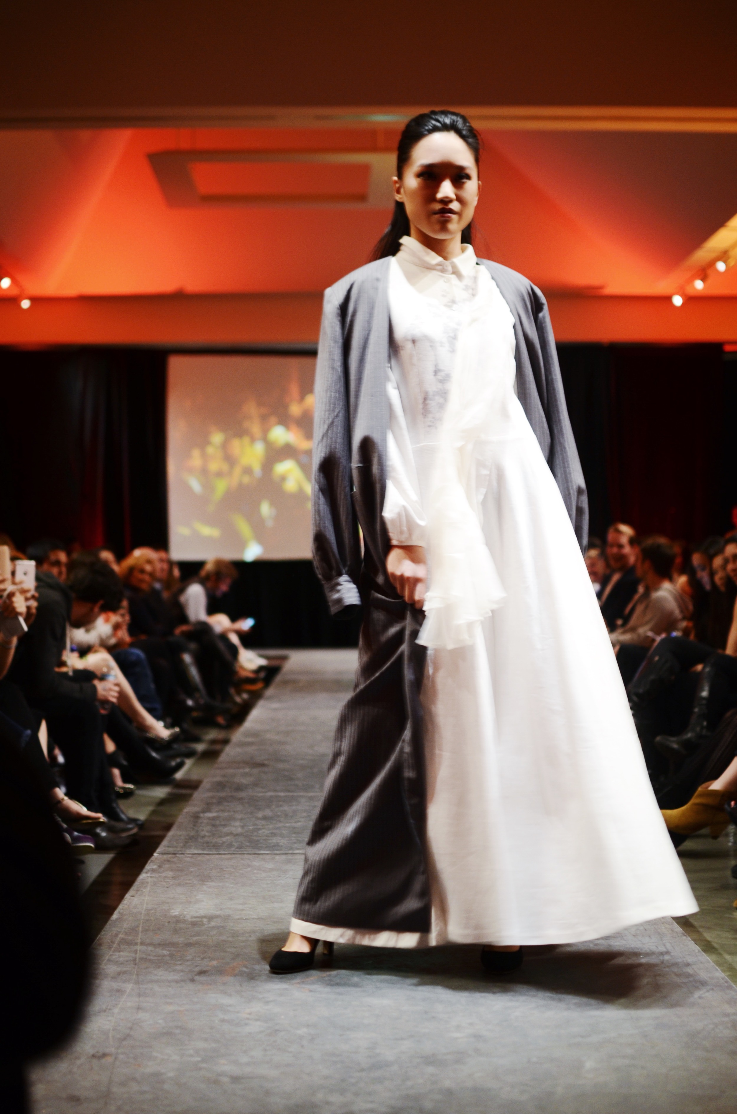
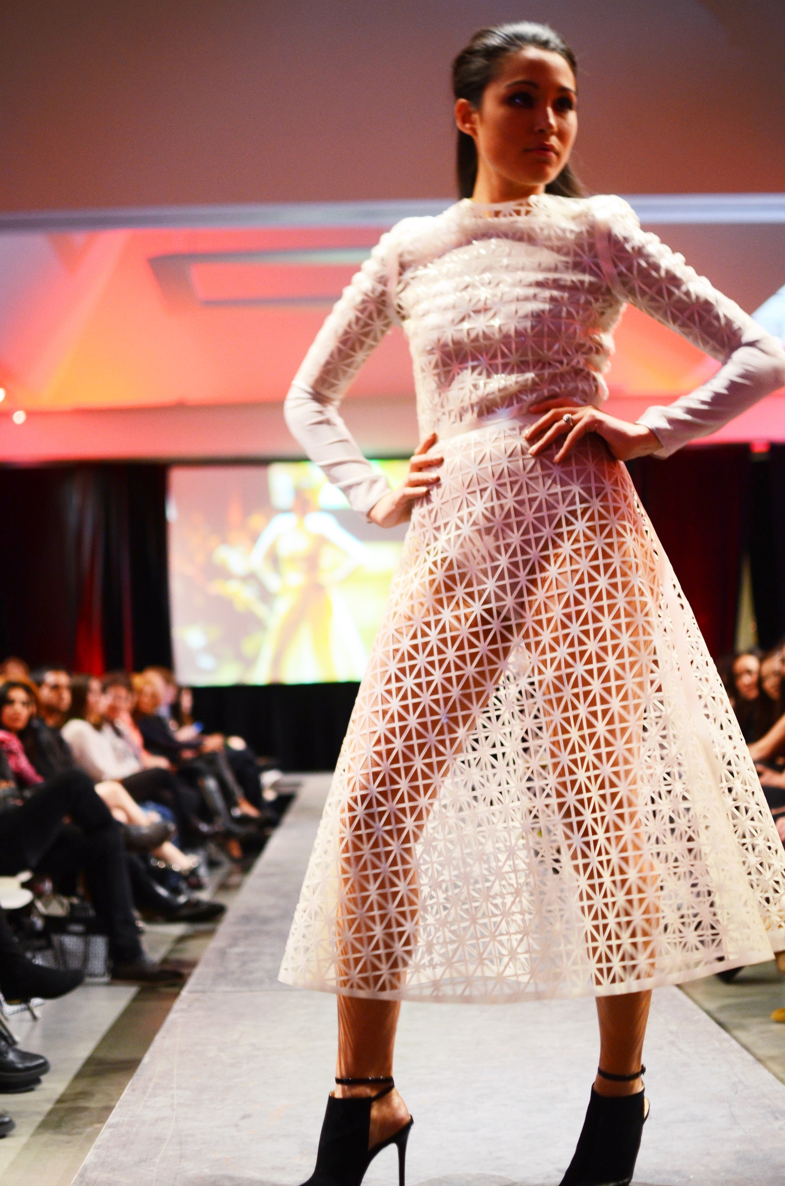
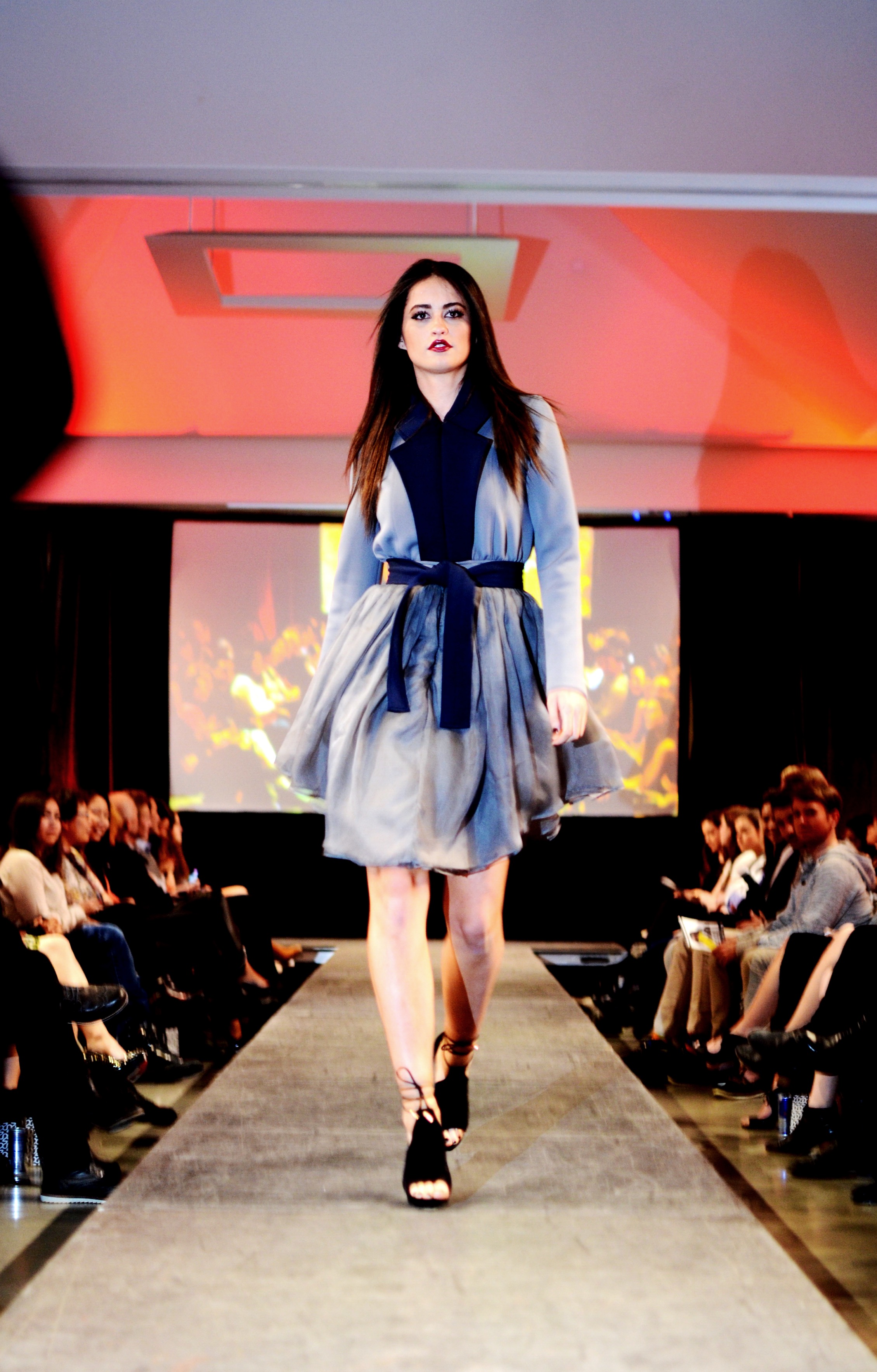
Sitting at the end of the runway amidst eager photographers and the event's official cinematographer, gave us a sense of importance.  Fully immersed in each dress twirl, each piercing, smoldering look of the eyes, we couldn’t have had a better night. Suffice it to say, acting as mild press for Identities gave us a taste of similar opportunities to come – crossing our fingers!

Xx, Katherine & Maia

All photos by Katherine


A Hunt of Color


On a windy Wednesday afternoon, I set out to scavenge around Harvard Square with a mission to spot an exact shade of reddish brown that is apparently well regarded as “Cogswell Cedar.” This task wasn’t so much chosen on a whim in order for me to spend an hour or so holding up a swatch of paint to buildings, flowers, and burritos, but rather it was a task given to me as part of a class called Art of Looking.

This course, taught by Professor Robin Kelsey, explores how we perceive visual information through various mechanisms. Or, to poach a more well crafted description from the course website:

“There is no such thing as ‘just looking.’ We are immersed today in a world of superabundant visual information, and we are avid users of visual technologies such as smartphones and digital cameras. But few of us recognize how thoroughly our habits, experiences, and ways of thinking have been conditioned by visual interfaces that have long and complex world histories. To get at these histories, this course is organized around a series of visual technologies, broadly conceived.”

This week’s visual technology brought us to color systems. I have always been fascinated by color; from purchasing the extended pack of sharpie highlighters, to insisting on owning all of the pastel post-its, to even associating colors with personalities and feelings (what I like to consider a very mild but intriguing form of synesthesia – a lengthy detour I might incorporate into my final paper for this class). I have earned titles in color coordination and living life vibrantly through a radiant palette – both of which may have no substantive merit, but I prefer to think that they do.

As the compliment assignment to our lecture on color systems, we were each given a random paint swatch in which we were told to find anything that matched its color. While some students took that as finding a color that resembles a similar family, or would look good if you were trying to pair blue flats with faded jeans, I took the assignment at face value: find something, anything, that matched my swatch exactly. Here’s when I embarked on finding all things Cogswell Cedar. 

Given that I was actually off to New York for the weekend to celebrate my sister’s golden birthday (25 on the 25th of March) and her recent engagement (congrats again, Sisi!), I stowed my paint swatch carefully alongside my elegant, all black, dinner outfit and lace up heels. Surprisingly, I stumbled upon a pretty close match, right off the bat, yet there was no way I was turning in a picture of a dumpster from a New York side street… (it even pains me to include this picture in the post, but it must be done for visual reference).

Tabling my assignment until my return to the 617, I figured that it might turn out more fruitful if I scavenged with a friend. Section mate, Cesar, and a third straggler in tow, we all had our eyes peeled for anything Cogswell Cedar and Rocky Hill in sight. 

We found a colorful painting in my room – I told you I’m a color aficionado. 

We found crumbling bricks – shocker for Harvard’s campus right?

We quibbled over who could hold the paint swatch higher.

We even matched our swatches accidentally. 

Notice that the focal point of that picture is the (pretty off) blue on blue - sorry, Cesar. But, as I tried to hold my swatch out of the frame, I unexpectedly grazed it ever so perfectly against a pretty similarly colored flowerpot. And in this moment, I think I realized the point of this project. 

We all perceive color differently – it’s just like the way we all look at life differently. Not only can we chalk up our differences to the unique mechanisms in our eyes, but the way we think about color impacts how we see it. If blue is a ~cooler~ color to me, I might drift towards matching it with hues that have less red in them. That’s why exploring the square with six eyes in total made this project more fruitful. With each match attempt we discussed (or rather we teased) how off one another were and how that couldn’t possibly be Cogswell Cedar, it’s too purple!

Even in just looking at all the photos we took, our paint swatches look different in every shot. With every dose of sunshine, or cast of a shadow, our colors appeared differently. That's just how ephemeral color is. 

At the end of the day, we had just as much fun laughing at our mistaken matches as we did figuring out what on earth was Cogswell Cedar. And if you're left with the burning question as to which photo I ultimately submitted for my assignment, I chose the Chipotle jalapeño. Which, in hindsight, is still a little too purple. 

Xx, Maia

(With some guest photography by Cesar himself)