All About Ultraviolet
Last week, Pantone announced the color of the year for 2018. This is big, in color news, mind you. Pantone practically says "Jump!" and designers around the world say, "In what color?"
For 2018, Pantone enchants us with Ultraviolet.
Here, give it a listen while you give the rest of this post a read:
You and I both know that I sense that colors have personalities. Hence my whole concept of Color Rx. So, to read Pantone's take on the emotional connectivity of this color really made my day:
"Inventive and imaginative, Ultra Violet lights the way to what is yet to come."
"Historically, there has been a mystical or spiritual quality attached to Ultra Violet. The color is often associated with mindfulness practices, which offer a higher ground to those seeking refuge from today’s over-stimulated world. The use of purple-toned lighting in meditation spaces and other gathering places energizes the communities that gather there and inspire connection."
- Pantone Color of the Year Announcement
Courtesy of www.Pantone.com
Ultraviolet has long been known for its spiritual capacity - especially in my family. I can think back to several instances in which I've been encouraged to surround people and places in "violet light." For example, during Hurricane Irma that was projected to barrel towards Miami, causing my friends and family to evacuate, I was asked to surround our home in violet light. To simply visualize the purple-ish aura around our house in order to keep it safe.
Maroon 5 Concert, 2014
With such a potent, meditative quality, this hue has also been a longstanding feature in movements across art history. Expertly spelled out in Artsy's post, "What Art History Tells Us about Ultra Violet, Pantone’s Color of the Year," here are some of the most salient combinations of emotion & art:
"[Monet's] enthusiasm rubbed off on his Impressionist peers, and soon the group’s penchant for the hue was being described as “violettomania,” a purported symptom of hysteria. Supporters of the Impressionists, however, believed they had “an acute perceptual facility that allowed them to see ultraviolet light at the extreme edge of the spectrum, invisible to others’ eyes,” as Stella Paul explains in her book Chromophilia: The Story of Color in Art."
"Similar to the Impressionists, [Georgia O’Keefe] didn’t seek to depict reality. Rather, she used color and form to convey more intangible forces—here, warmth, sensuality, and vigor."
"Abstract Expressionist painter Mark Rothko also played with the color’s religious associations when he filled his magnum opus, the Rothko Chapel in Houston, Texas, with maroon, plum, and deep mauve canvases. Unlike Bacon’s figurative approach, however, Rothko focused on the soothing, meditative power of the violet spectrum. During the same era, James Turrell began experimenting with his ethereal, immersive Light and Space environments. Some he lit monochromatically with deep, diffused fuschia; the experience of entering these spaces has similarly been described as religious."
- Alexxa Gotthardt for Artsy
In talking about color, it seems like everyone dons a spiritual hat and tries to describe what they sense in the same way dollar-store-psychics write about weekly horoscopes. Not to say I haven't done that myself. In describing colors for Color Rx, I balanced historical background on the pigments with resonant feelings I believed were tied to the hue - while still trying to write about them in a broad enough manner that they would be relatable to more people. Here are two that I came up with for the project:
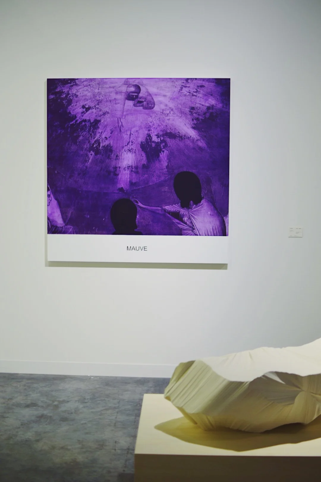
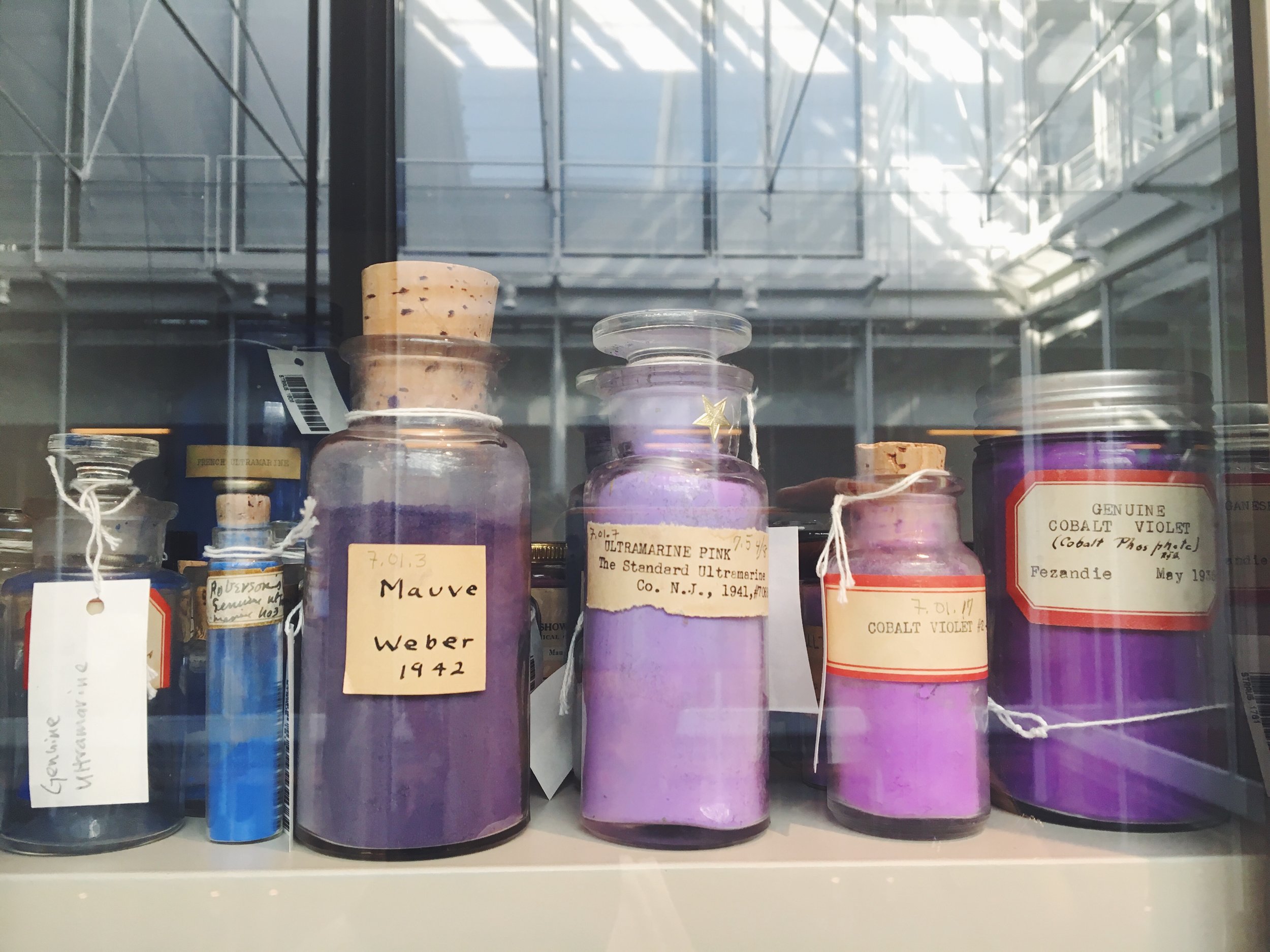
Patented in 1856 by Scottish chemist, William Perkin, Mauve was the first synthetic based dye, also referred to as a coal tar color. Perkin originally referred to this pigment as "Tyrian Purple" to up its appeal, though it is rumored that his critics called it Purple Sludge. Dim and dark, Mauve embodies the ability to block out any unwanted noises in life. Tap into Mauve's dusky aura to re-center yourself.
A synthetic pigment commercially known as Nuremberg Violet, Manganese Violet is heat-proof and non-toxic. It has been used in frescos and paintings, though tends to tint them unfavorably. Earthy and quiet, Manganese Violet radiates a warmth that grounds you and brings you back to your roots - whether that be physically or mentally. Allow yourself to feel anchored by its safe embrace.
- Maia Leandra for Color Rx
Pigments from the Harvard Art Museums' Forbes Pigment Collection
So, as the year closes and we prepare to welcome 2018, keep Ultraviolet in mind. If not for it's powerful, emotional resonance, than for the mere fact that it is a simply soothing shade.
Me, circa NYE 2015
Xx, Maia


