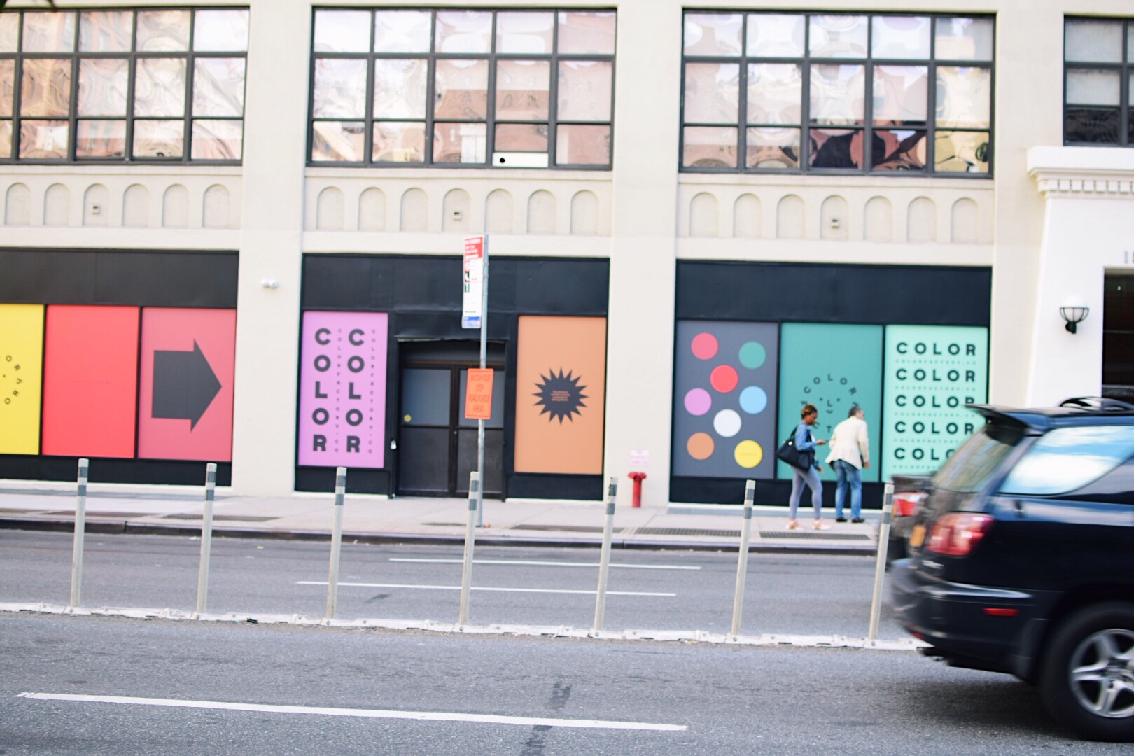
New York, New Color Factory


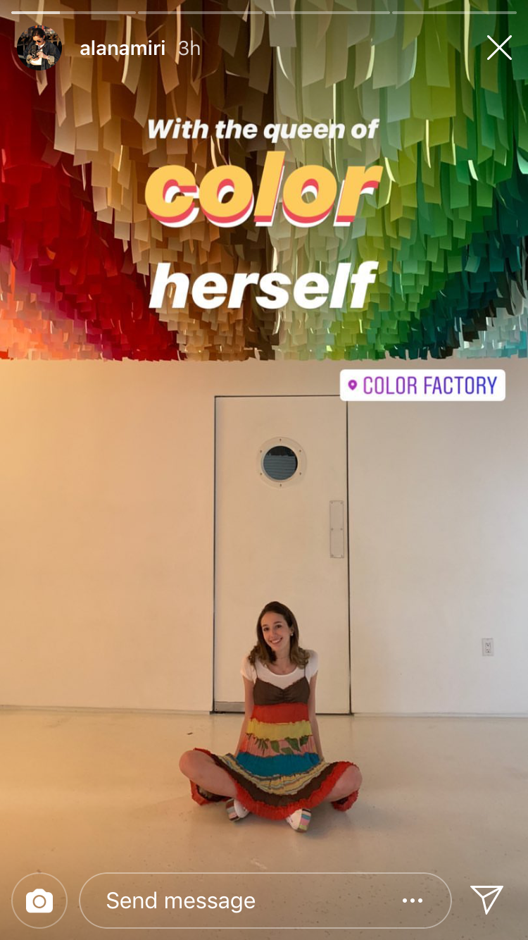
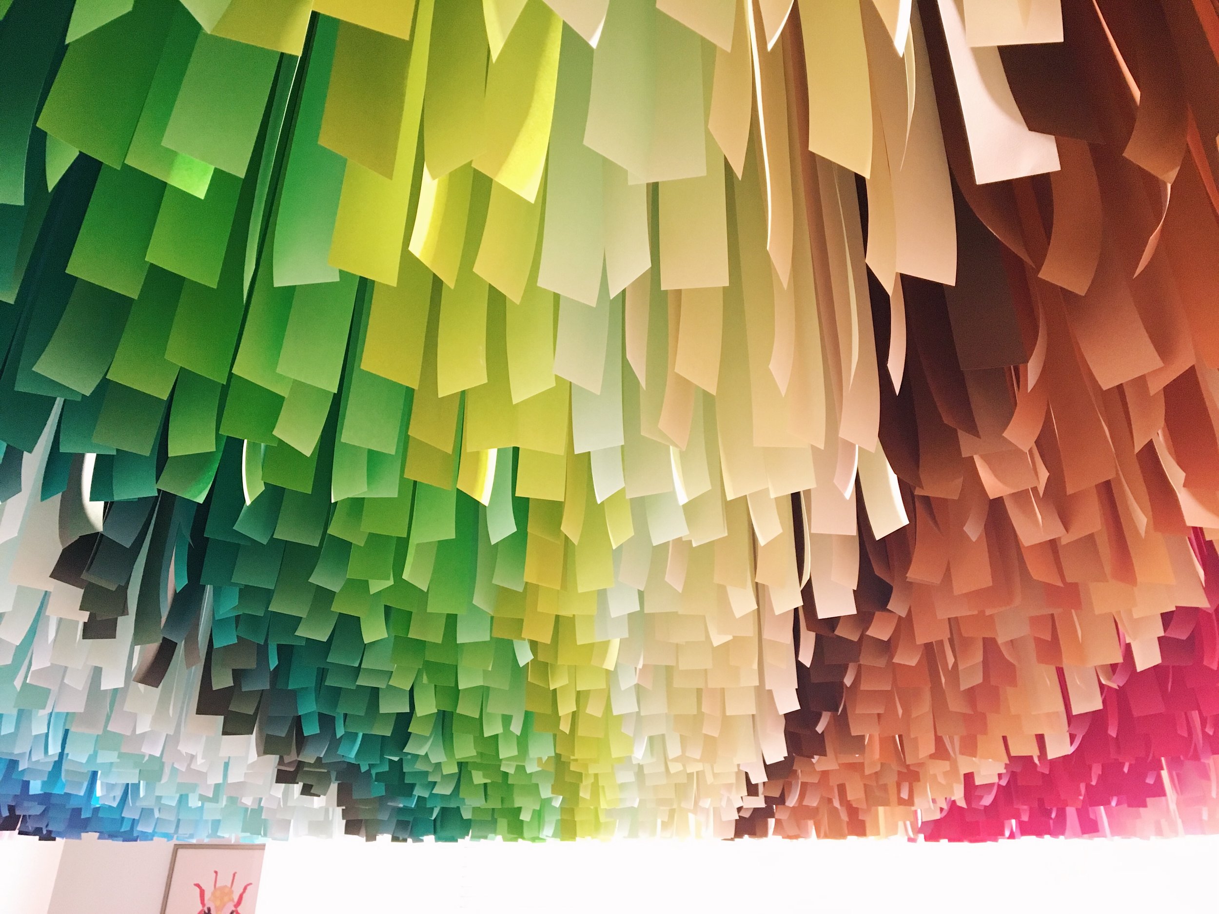
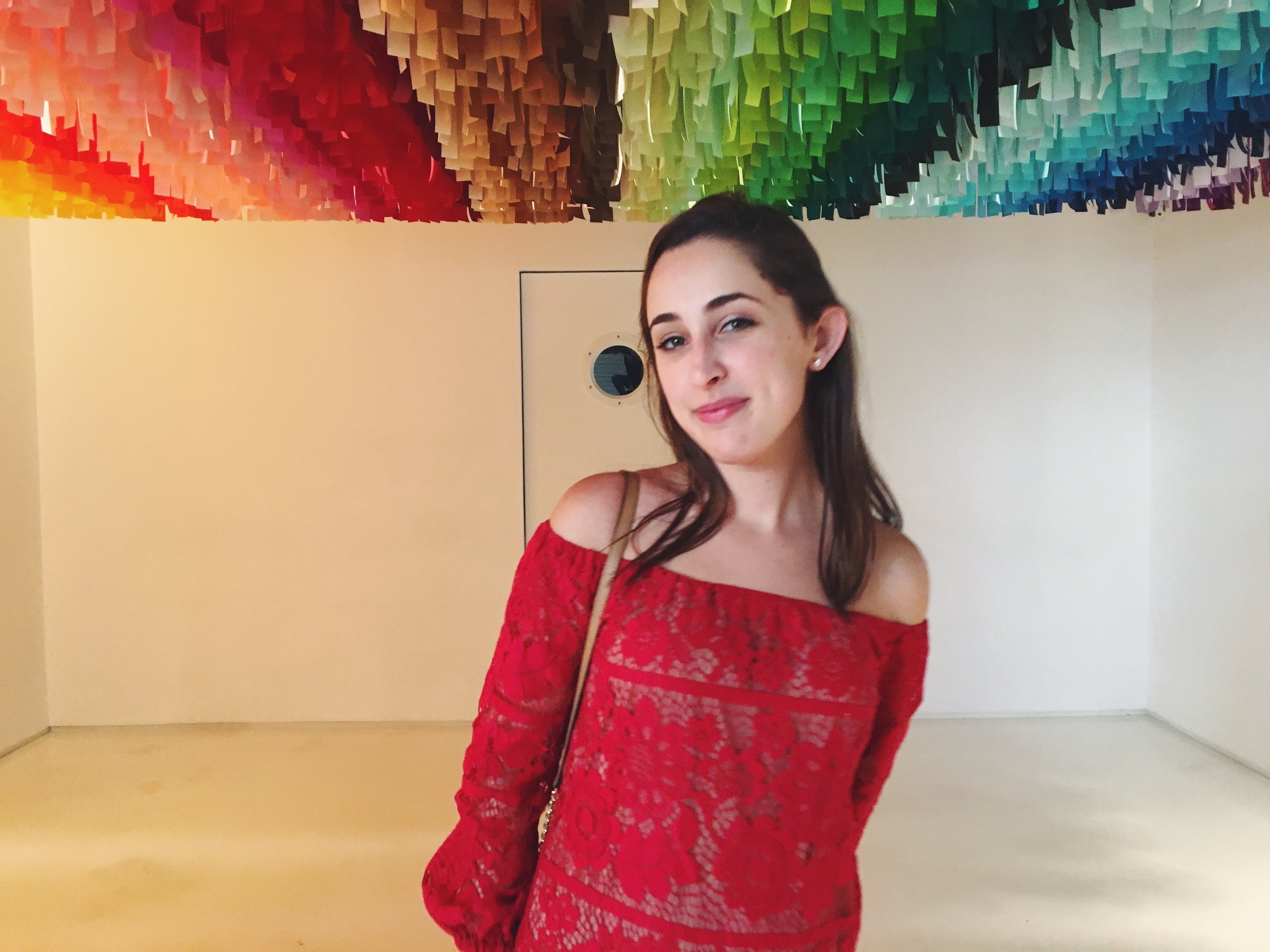
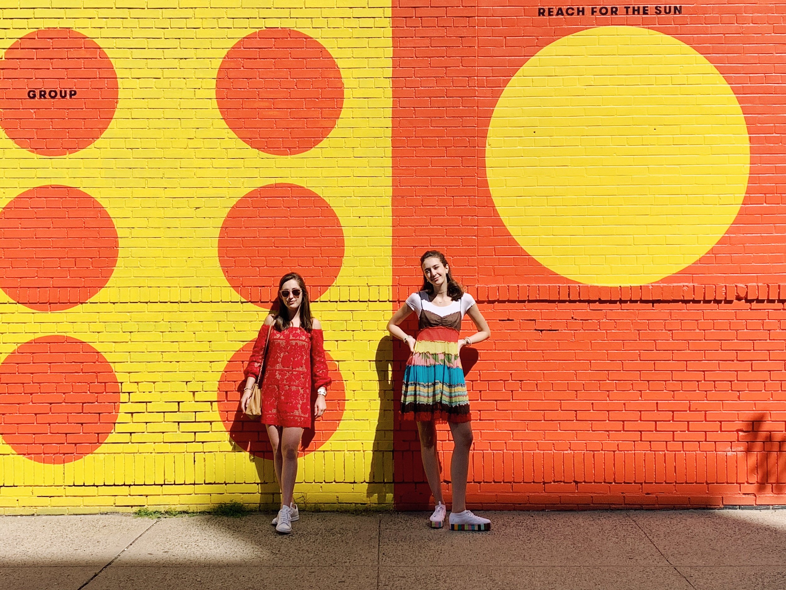
A trip to the latest Color Factory show in NYC calls for digging up my sister’s old Middle School era dress because it is a twirl-able rainbow incarnate. Dressed in the visible color spectrum and fully funded by my gracious department of History of Art & Architecture, I was ready to take in what this new iteration of The Color Factory had to offer - camera and notes in hand.

As I begin to fine tune the scope of my thesis, a project which I have spent years amassing color-related content for, I realize that part of what I want to tap into is the reason behind art’s newfound color craze. Specifically, how intrinsic qualities of color lend themselves to depicting ephemeral experiences in ways that other mediums cannot.

What I found in NYC was just that.

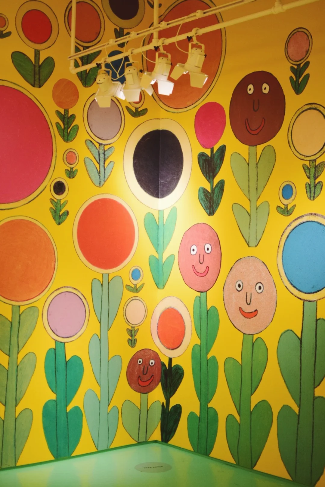
This version of The Color Factory focused on attendee’s relationships to each other and to themselves, using color as the catalyst. After entering through a rainbow tunnel reminiscent of the ribbon wall at Color Factory’s SF show, we were greeted with the most visually pleasing welcome video ever to grace my eyes. Once registering and picking up a sparkling macaron for the road ahead, we all entered through a tunnel boasting walls of buttons that directed us to select the color that most resonated with us. Naturally I chose a dusty rose button and joked that this tunnel visualized what I think my brain looks like.

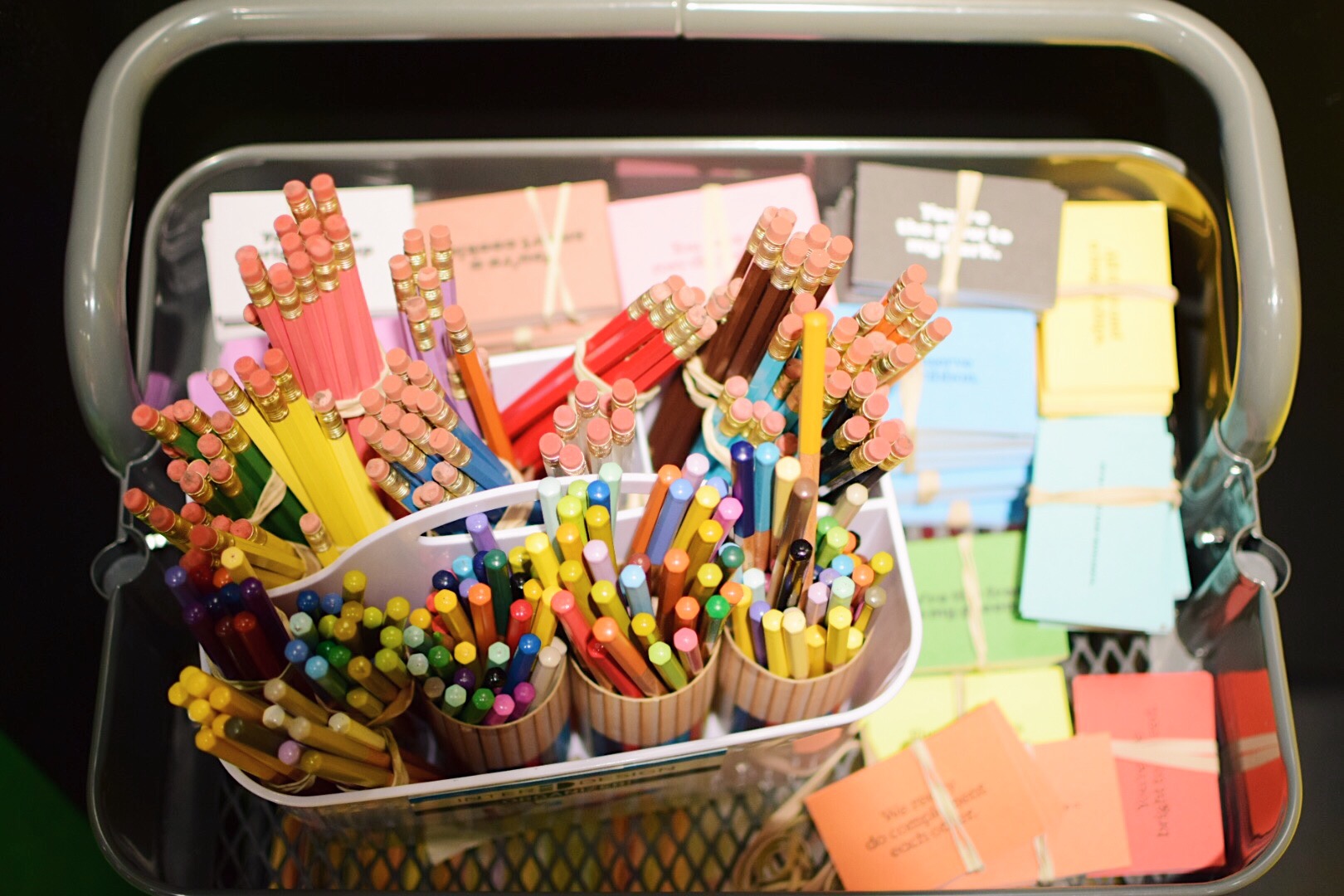
On the other side, we were split up into two groups and funneled into a parlor room where we were seated across from someone and guided through a series of activities through coordinated audio. The premise of this room was to compliment. Sitting in complementary colors, my partner Alana and I were instructed to select colors that represented each other. We also had to do a contour drawing without breaking eye contact with one another, and then were treated with complementary, complementary candies tastefully chosen to pair well with each other.

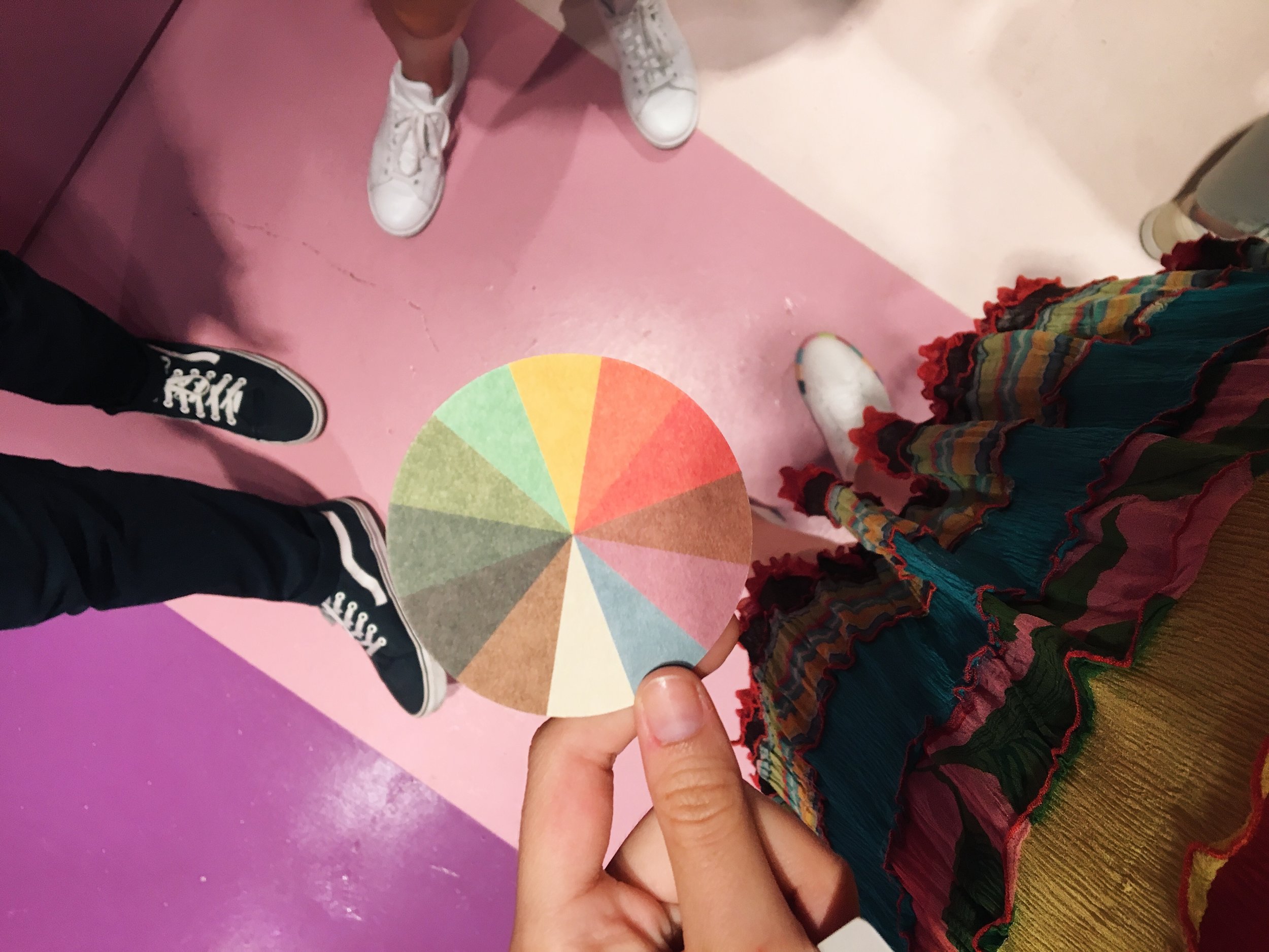
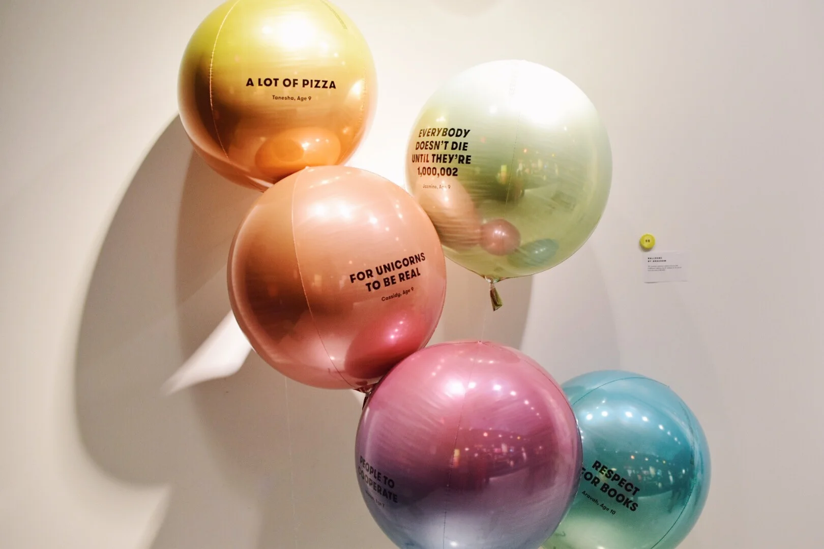
Next up was a sound experience room where we each played notes from complimentary keys. Post the twinkling of our eardrums, we entered a room bathed in sunset and filled with balloons with wishes written on them. Trying to snag a photo in this room was like battling with a windstorm, and we ended up getting a handful of Magritte-esque Son of Man portraits. Exiting the sunset room led us to a roadmap of personality questions that ultimately deposited us at the door of our individual, secret color. Each room was grouped by hue, and afterwards we were directed to take a paint-chip style memento of our secret color, complete with a cue for the next room: a disco fever themed dance floor - where we could strike a pose based on the suggestion written on our secret color card.

For an educational interlude, there was a hallway with alphabetically organized vertical drawers that featured pigments and their color histories. Unsurprisingly, this room was created by Kassia St. Clair, author of The Secret Lives of Color - one of the many titles decorating my bookshelf and on the list of potential thesis sources in my never ending bibliography spreadsheet. In a similar vein, the next room presented us with pie charts of NYC stats, displayed in spin-able and boomerang-able benches.

Last up, similar to the SF show, was a wall to wall ball pit filled with the most soothing shade of blue. This was the point where my friends and I paused our analytical note-taking and just felt like kids again. And with that, the magic of The Color Factory was concluded, though the tingling feeling of being surrounded by such a happy collection of hues will provide the joy and motivation to carry me through the monochromatic winter months ahead.

Xx, Maia


All About Ultraviolet


Last week, Pantone announced the color of the year for 2018. This is big, in color news, mind you. Pantone practically says "Jump!" and designers around the world say, "In what color?" 

For 2018, Pantone enchants us with Ultraviolet.

Here, give it a listen while you give the rest of this post a read: 

You and I both know that I sense that colors have personalities. Hence my whole concept of Color Rx. So, to read Pantone's take on the emotional connectivity of this color really made my day:

"Inventive and imaginative, Ultra Violet lights the way to what is yet to come."

"Historically, there has been a mystical or spiritual quality attached to Ultra Violet. The color is often associated with mindfulness practices, which offer a higher ground to those seeking refuge from today’s over-stimulated world. The use of purple-toned lighting in meditation spaces and other gathering places energizes the communities that gather there and inspire connection."

- Pantone Color of the Year Announcement

Courtesy of www.Pantone.com

Ultraviolet has long been known for its spiritual capacity - especially in my family. I can think back to several instances in which I've been encouraged to surround people and places in "violet light." For example, during Hurricane Irma that was projected to barrel towards Miami, causing my friends and family to evacuate, I was asked to surround our home in violet light. To simply visualize the purple-ish aura around our house in order to keep it safe. 
Maroon 5 Concert, 2014

With such a potent, meditative quality, this hue has also been a longstanding feature in movements across art history. Expertly spelled out in Artsy's post, "What Art History Tells Us about Ultra Violet, Pantone’s Color of the Year," here are some of the most salient combinations of emotion & art: 

"[Monet's] enthusiasm rubbed off on his Impressionist peers, and soon the group’s penchant for the hue was being described as “violettomania,” a purported symptom of hysteria. Supporters of the Impressionists, however, believed they had “an acute perceptual facility that allowed them to see ultraviolet light at the extreme edge of the spectrum, invisible to others’ eyes,” as Stella Paul explains in her book Chromophilia: The Story of Color in Art."

"Similar to the Impressionists, [Georgia O’Keefe] didn’t seek to depict reality. Rather, she used color and form to convey more intangible forces—here, warmth, sensuality, and vigor."

"Abstract Expressionist painter Mark Rothko also played with the color’s religious associations when he filled his magnum opus, the Rothko Chapel in Houston, Texas, with maroon, plum, and deep mauve canvases. Unlike Bacon’s figurative approach, however, Rothko focused on the soothing, meditative power of the violet spectrum. During the same era, James Turrell began experimenting with his ethereal, immersive Light and Space environments. Some he lit monochromatically with deep, diffused fuschia; the experience of entering these spaces has similarly been described as religious."

- Alexxa Gotthardt for Artsy

In talking about color, it seems like everyone dons a spiritual hat and tries to describe what they sense in the same way dollar-store-psychics write about weekly horoscopes. Not to say I haven't done that myself. In describing colors for Color Rx, I balanced historical background on the pigments with resonant feelings I believed were tied to the hue - while still trying to write about them in a broad enough manner that they would be relatable to more people. Here are two that I came up with for the project:

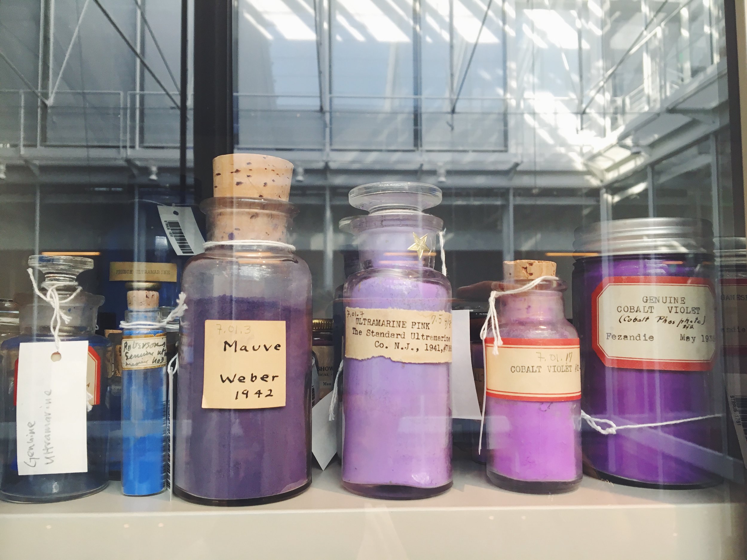
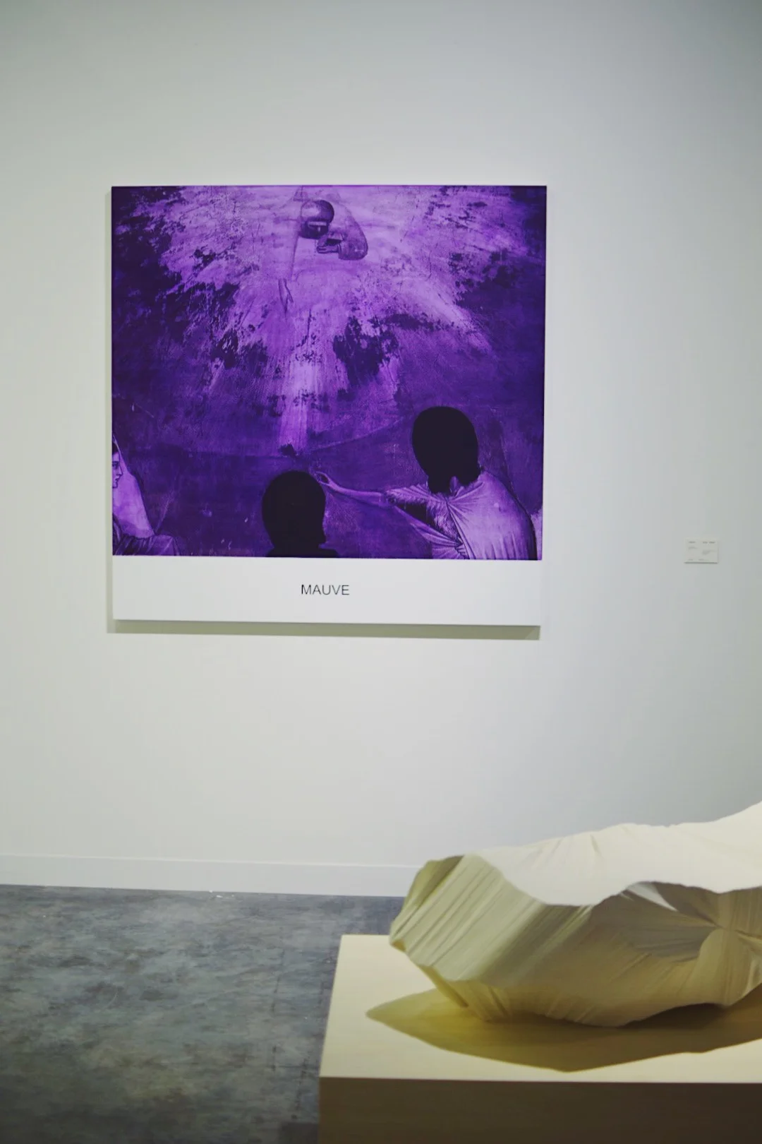
Patented in 1856 by Scottish chemist, William Perkin, Mauve was the first synthetic based dye, also referred to as a coal tar color. Perkin originally referred to this pigment as "Tyrian Purple" to up its appeal, though it is rumored that his critics called it Purple Sludge. Dim and dark, Mauve embodies the ability to block out any unwanted noises in life. Tap into Mauve's dusky aura to re-center yourself.

A synthetic pigment commercially known as Nuremberg Violet, Manganese Violet is heat-proof and non-toxic. It has been used in frescos and paintings, though tends to tint them unfavorably. Earthy and quiet, Manganese Violet radiates a warmth that grounds you and brings you back to your roots - whether that be physically or mentally. Allow yourself to feel anchored by its safe embrace.

- Maia Leandra for Color Rx 

Pigments from the Harvard Art Museums' Forbes Pigment Collection

So, as the year closes and we prepare to welcome 2018, keep Ultraviolet in mind. If not for it's powerful, emotional resonance, than for the mere fact that it is a simply soothing shade. 

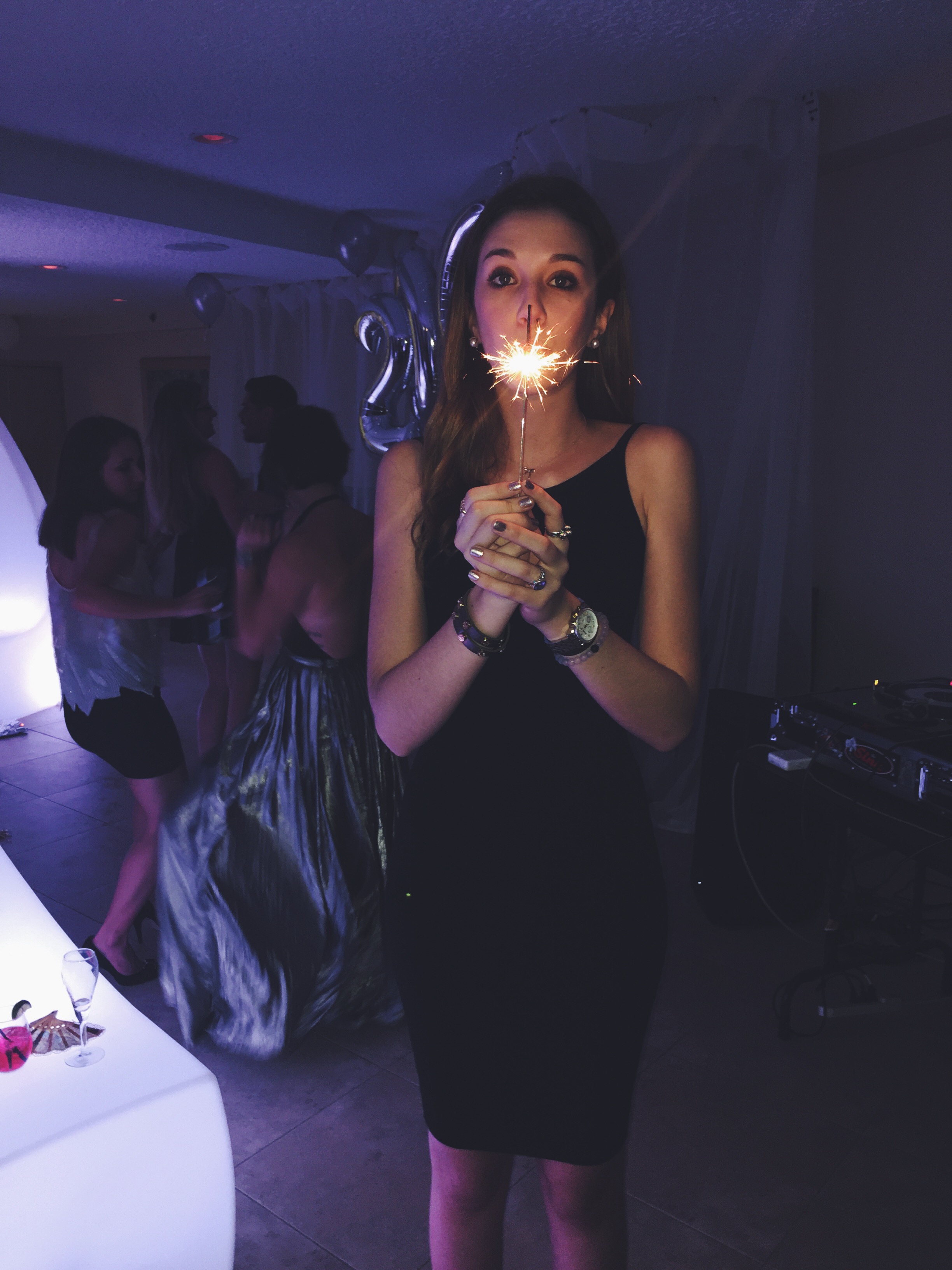
Me, circa NYE 2015

Xx, Maia 
 

Fall Findings: a Leaf Hunt


Seasons are such a novel concept to me.

Growing up in a land of Hot, Extra Hot, Extremely Hot, and Unbearably Hot, the idea that a a spectrum of degrees from 0 to 100 (real gradually) could occur in the same location was unimaginable. Sure I had seen pictures of fall foliage and heard songs like White Christmas, but seeing was really believing when I set up shop in Cambridge for my first Northeastern fall two years ago. 

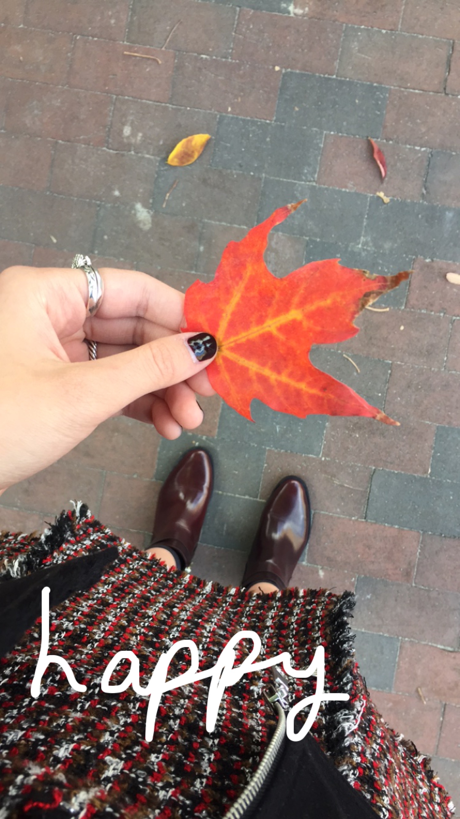
I remember noticing the first leaves change color. I was walking to class and almost stepped on a treasure: a small, raindrop shaped leaf that was predominately brown, but budding red from its core. Naturally, I picked it up and put it in my phone case (temporarily replacing the Polaroid photo of Fairchild I normally keep in there). Once I made it safely home that day and the precious leaf had survived the voyage, I transferred it to the safety of being sandwiched in between pages of my idea journal - a location it lives in to this day. 

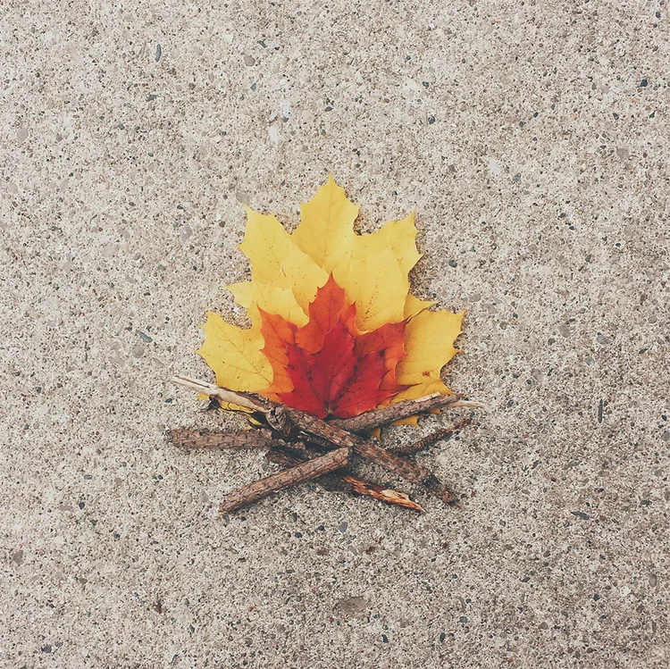
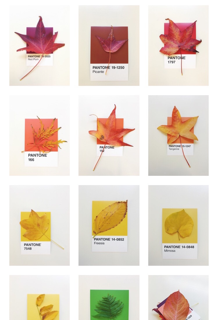
(Images from artist @danikation)

Now, every fall, I make it a point to find that first leaf, radiating with disjointed color, begging to be cherished. This year, I took that singular hunt to the next level. I'm talking waking up early on a Friday morning to intentionally collect a tote bag full of foliage with my adventure buddy Lily. Together we collected a decent smattering of hues, from perky yellows to velvety reds, and some foundational greens for good measure. 

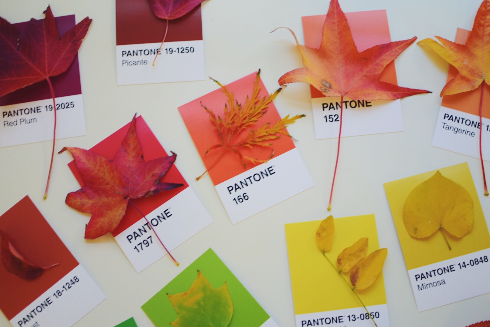
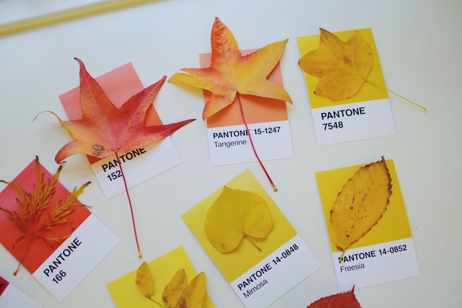
With all of these vibrant shades radiating in my room, I couldn't help but draw parallels in their graduating tones to the collection of Pantone chips I oh so handily had stashed nearby. Lily and I matched each leaf to each Pantone chip, debating whether to match the leaves by their core color or their outer color, and settling for a combination of both. 

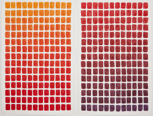
The final product looked like a spilled package of Mike & Ikes as much as it recalled imagery like Spencer Finch's Where Does Red Begin and Where Does it End? 

(Image courtesy of www.spencerfinch.com)

Fall, to me, is the most robust expression of nature's own color palette, and now I've captured it to enjoy - despite the current status of barren trees and winter looming. 

Xx, Maia