A Taste of Curation: Neuroaesthetics at HAM
The Harvard Art Museums, affectionately referred to as “HAM”, places students at the forefront. From affording them research and work opportunities, to hosting lectures of all subjects in the museum, to allowing us to use the Art Study Center to sit alone with original works of art, HAM truly operates with students at the helm.
As a member of HAM’s Student Board, I have had the great fortune of hearing from different museum faculty about their work within the museum and how, often times, students can get involved. During one particular meeting last Spring, Laura Muir (Research Curator for Academic and Public Programs) spoke to us about the University Teaching Gallery: a space for Harvard courses to select objects from the museum to accompany their syllabus and encourage students to apply what they’re learning in class to objects that they encounter outside the classroom. In concluding this discussion, Laura mentioned she was in the process of selecting the courses to participate in this gallery for the Fall semester.
Since I’ve always been curious about how exhibitions are put together (everything from the narrative arc to the politics of acquiring desired pieces), I jumped at the opportunity to get involved. I immediately thought of working with my Neuroaesthetics Professor, Dr. Nancy Etcoff, to propose objects that would add a visual element to her already robust course design.
So, with the guidance from collaborating with Dr. Etcoff and the help of Laura in synthesizing our ideas, Harvard’s first ever class focused exhibit on Neuroaesthetics was unveiled in this Fall of 2018. Here’s a bit about what you’ll see if you visit, and how this opportunity has changed the way I experience museums for the better:
In looking at the course syllabus and teasing out the topics that would benefit most from visual counterparts, we structured the 9 objects in the exhibit to follow the themes of The Face / Gaze, What is Beauty / Art, Synesthesia / The Sublime, Longing / Melancholy, and The Uncanny.
The Face / Gaze
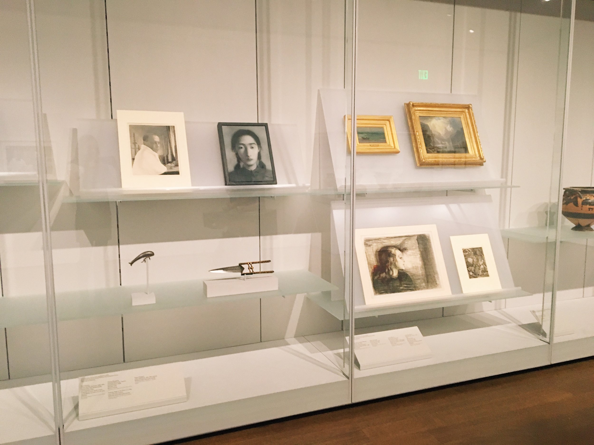
Paul Citroen “Self Portrait.” & Zhang Xiaogang “Portrait.” (Images from HAM Website)
For this portion, we were inspired by studies we’d read in the course that discussed how people perceive others’ affects based on how we interpret their gaze. In one particular study, it was explained that a portrait of a man was perceived as affable when told the man was looking at a scene of a family, but his look instantly became lecherous when told he was gazing at a swimsuit model. With this disparity, we want viewers to wonder about the affect of these sitters, and, how (if at all) that changes when positioned looking at I’m With Stupid (info below) in the gallery space.
What is Beauty / Art?
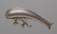
Unknown Artist, “Katar Dagger.” & Unknown Artist, “Priming Flask in the Form of a Fish.” (Images from HAM Website)
The course opens with a discussion about what is art and what is beauty. Can tools be aesthetic objects? And, if so, why? These two objects meld functionality and ornamentation. The left dagger doubling as protective, yet decorative, arm wear, and the right flask being designed to emulate the body of a fish. The latter example even ties in with the current special exhibition on view in the museum, Animal Shaped Vessels!
Synesthesia / The Sublime
James Abbott McNeill Whistler, “Harmony in Blue and Silver: Beaching the Boat, Étretat.” & Albert Bierstadt, “In the Sierras.” (Images from HAM Website)
When people hear of “neuroaesthetics” the topic of synesthesia often comes to mind as it’s neurological cross-wiring has had well documented impact on the arts. Think Kandinsky and his desire to visualize music. While, there wasn’t a perfect example of Kandinsky to pull for the exhibition, we turned to Whistler and his similar motivation to combine music and visual art. Similar to the awe-inspiring underpinnings of synesthesia, the concept of the sublime comes into neuroaesthetics as being an extreme example of sensory overload. Here, we chose a classic, sublime landscape example by Bierstadt.
Longing / Memory
Edvard Munch, “The Sick Girl I.” & Johannes Wierix After Albrecht Dürer, “Melancholia.” (Images from HAM Website)
Depictions of sad affects are often the most easily recognizable for viewers, as the somber tone quickly resonates with past emotional experiences. For this phenomenon, we chose two depictions of melancholy and positioned them to be looking at one another. The left figure leaning more towards the realm of longing, and the right figure being a personification of melancholy herself.
The Uncanny
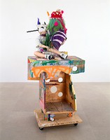
Rachel Harrison, “I'm With Stupid.” (Image from HAM Website)
My favorite inclusion in the exhibit has to be I’m With Stupid, as it challenges viewers to think about almost all of the above categories. Is it art? Or just a mishmash of cacophonous objects? What are the faces telling you? Can you even see them, or are they even human faces? Does it tantalize your senses? How so? And, ultimately, who is the ‘stupid’ that the title refers to? One of the two figures, or you?
For a museum who prioritizes student engagement and involvement, co-curating this exhibit had to be one of my favorite experiences here and best manifestations of the museum’s mission. I even talk a little bit about the experience in an article about another great museum moment: The Student Late Night.
Moral of the story: if you’re curious about something, go after it. Especially here at Harvard, a playground I’m fortunate to have access to, the resources are what you make of them.
Xx, Maia


