How Emotionally Resonant are Rothko's, Really?
If you know me (or have kept up with recent posts), you know how intrigued I am by color. So much so, I'm probably writing my senior thesis about it. I'm particularly curious about how different uses of color in art can accelerate emotional connectivity and convey artist's messages in a more experiential way. As an intangible element of art, color has several characteristics that come into play when discussing how it affects viewers.
Unlike some other more upbeat and whimsical employments of color, Mark Rothko explores the darker side of color's capabilities. "Darker” not only represents the harsher tones and somber affect present in the works of Mark Rothko, but also how the content dealt with in his work tends to be heavier, his execution more rough and visceral, and his desired message to convey is more desperate.
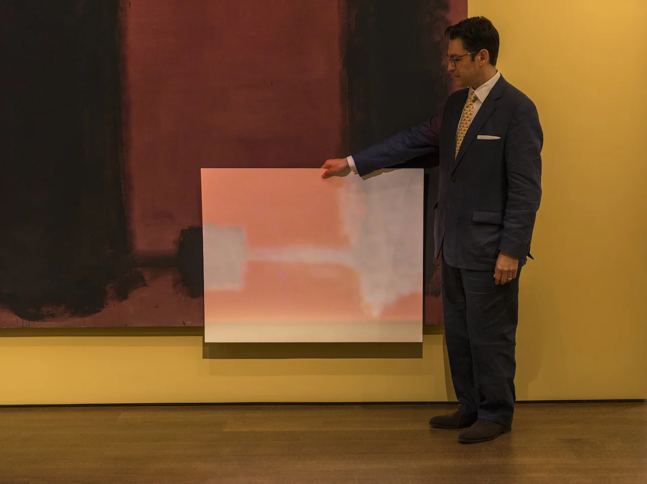
Mark Rothko was an Abstract Expressionist working in the 1940’s-70’s, painting massive color field canvases to expel the tension and despair he dealt with throughout his life. After being diagnosed with a mild aortic aneurysm, Rothko began using materials that reflected the instability of his condition. Therefore, his paintings tend to degrade at a quick rate, and have been subjected to various conservation techniques; most excitingly that of the Harvard Art Museums in 2015 who projected corrective light on the canvas to restore their original appearance.
Photo courtesy Peter Vanderwarker
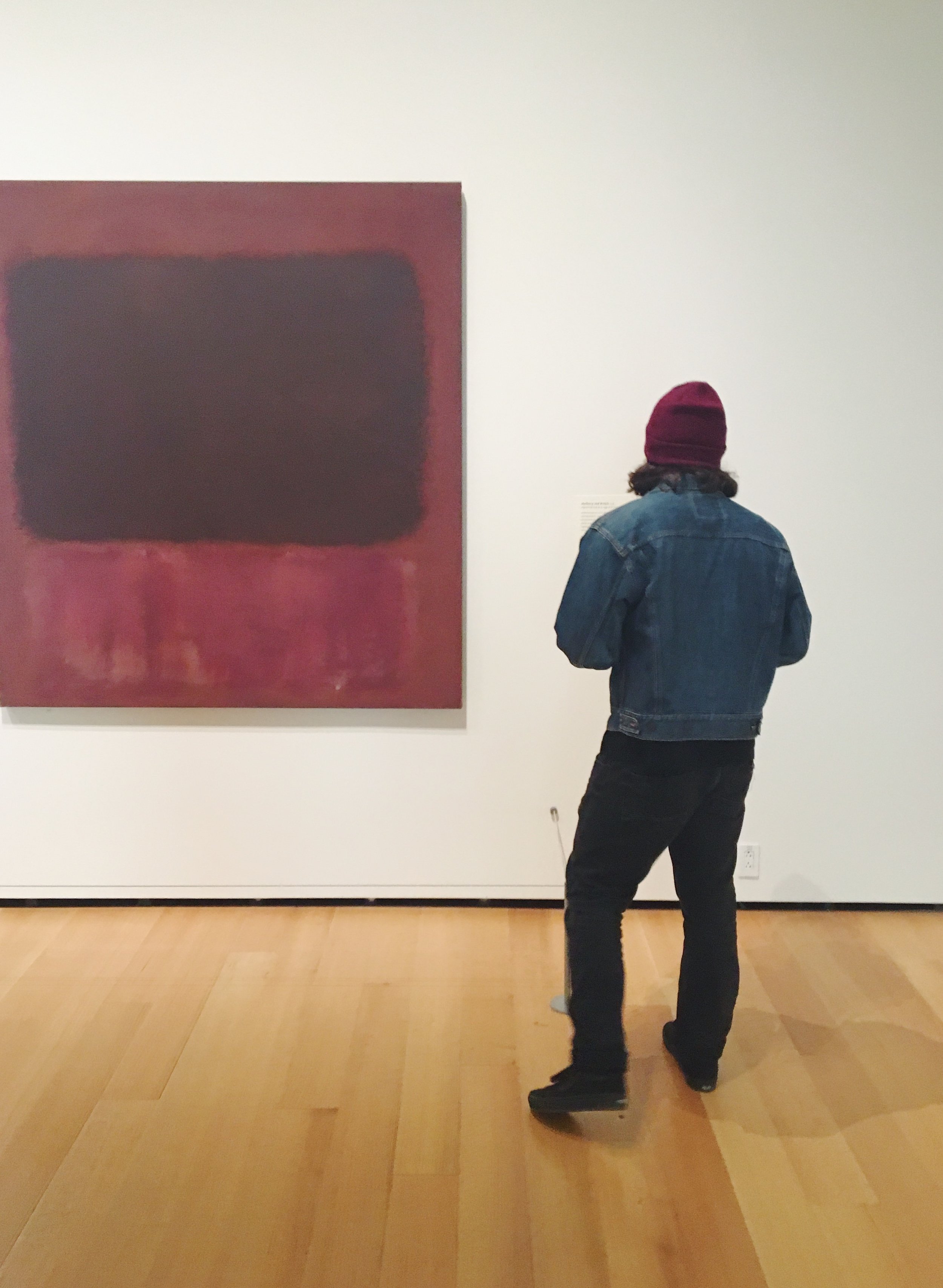
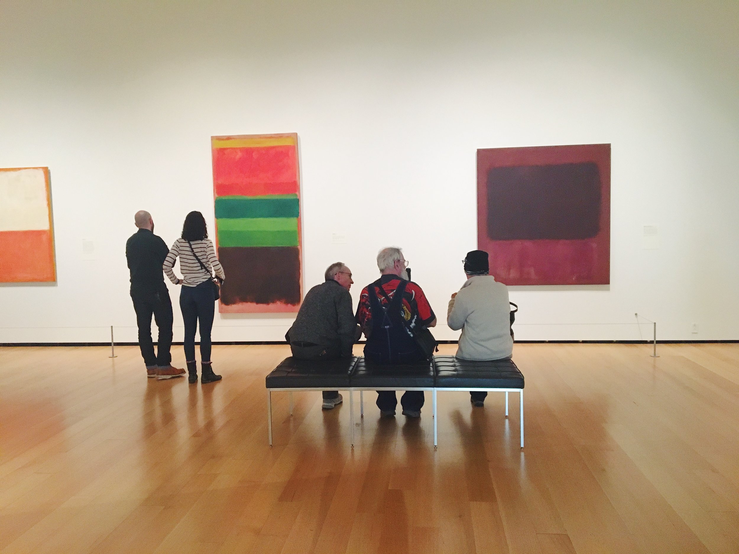
Looking at several of his canvases on display at the MFA, it’s interesting to pick apart the elements of his works that contribute to the particular feeling of experiencing them in person. Taking into consideration materials, size, and color palette, we can begin to understand what’s at play in a Rothko painting.
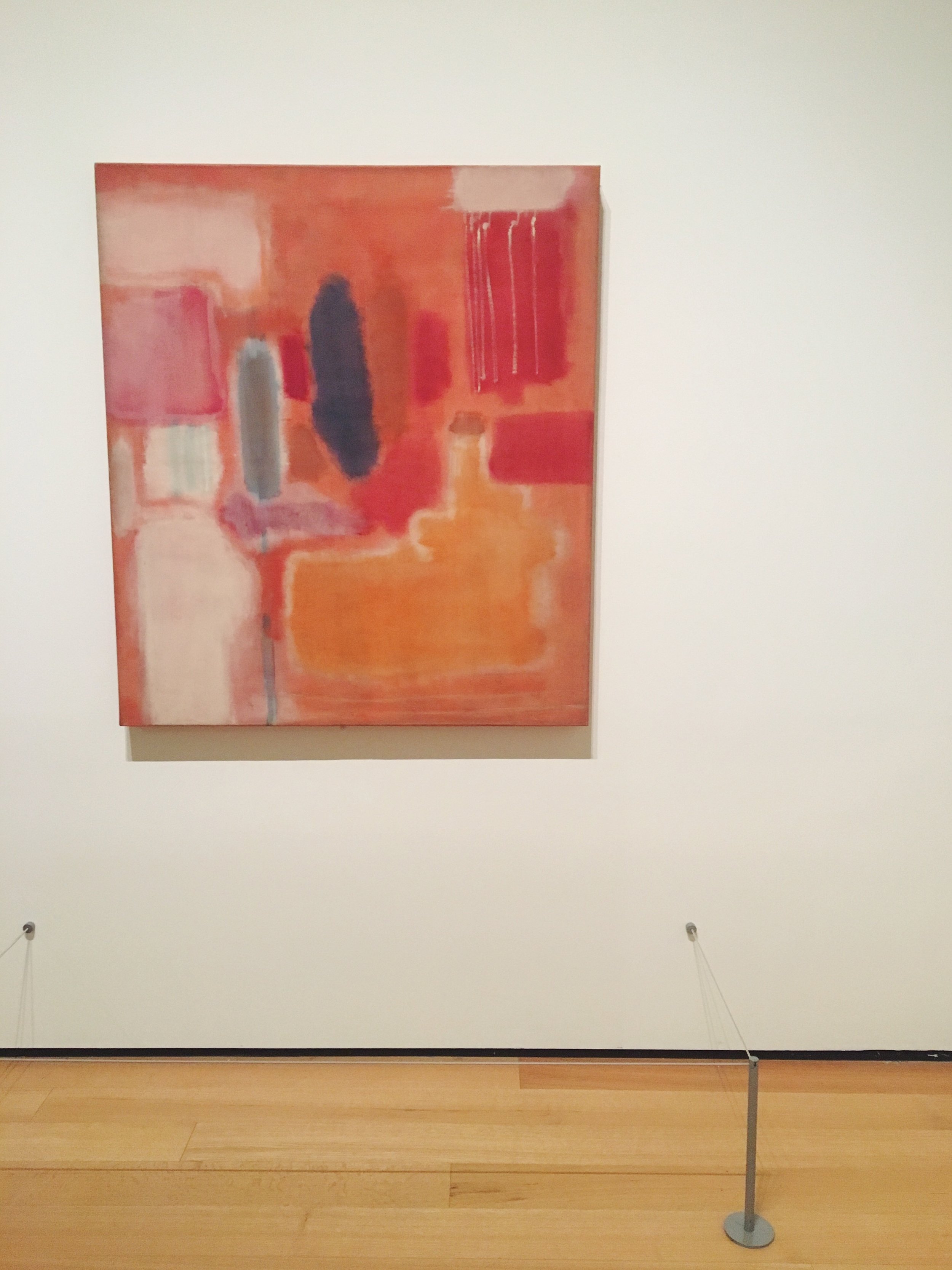
Rothko himself described his works as transcendent. Evidenced in No.9 (1948), a more jovial painting in color scheme, the colors act an actionable agents.
“I think of my pictures as dramas; the shapes in the pictures are the performers. They have been created from the need for a group of actors who are able to move dramatically without embarrassment and execute gestures without shame.”
(Mark Rothko quoted in MFA Wall Text)
No. 9 (1948)
This canvas depicts movement and the vibration of layered swatches. The colors, here, pulsate, perhaps due to the technique of watering down some of his pigments to allow for transparency in layering.
In Untitled (1949), Rothko starts to move towards a darker palette familiar to his “classic style.” Here, the colors struck me more personally, instantly eliciting a nostalgic memory of eating rainbow cookies in my childhood. Thus, the canvas managed to depict the colors of my heritage and helped me connect in an overtly symbolic manner.
By No.1 (1961), Rothko employed darker colors described in the wall text as, “the artist contrasts two muted green rectangles with a third, smaller shape of fiery red, all set against a somber maroon ground.” (MFA Wall Text) Notice how the descriptors of the colors are all emotive: "muted," "fiery," "somber."
No. 1 (1961)
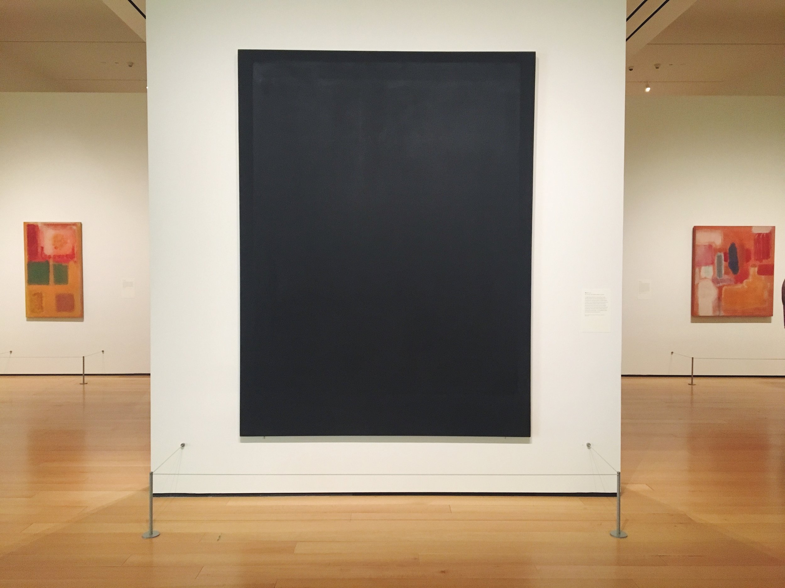
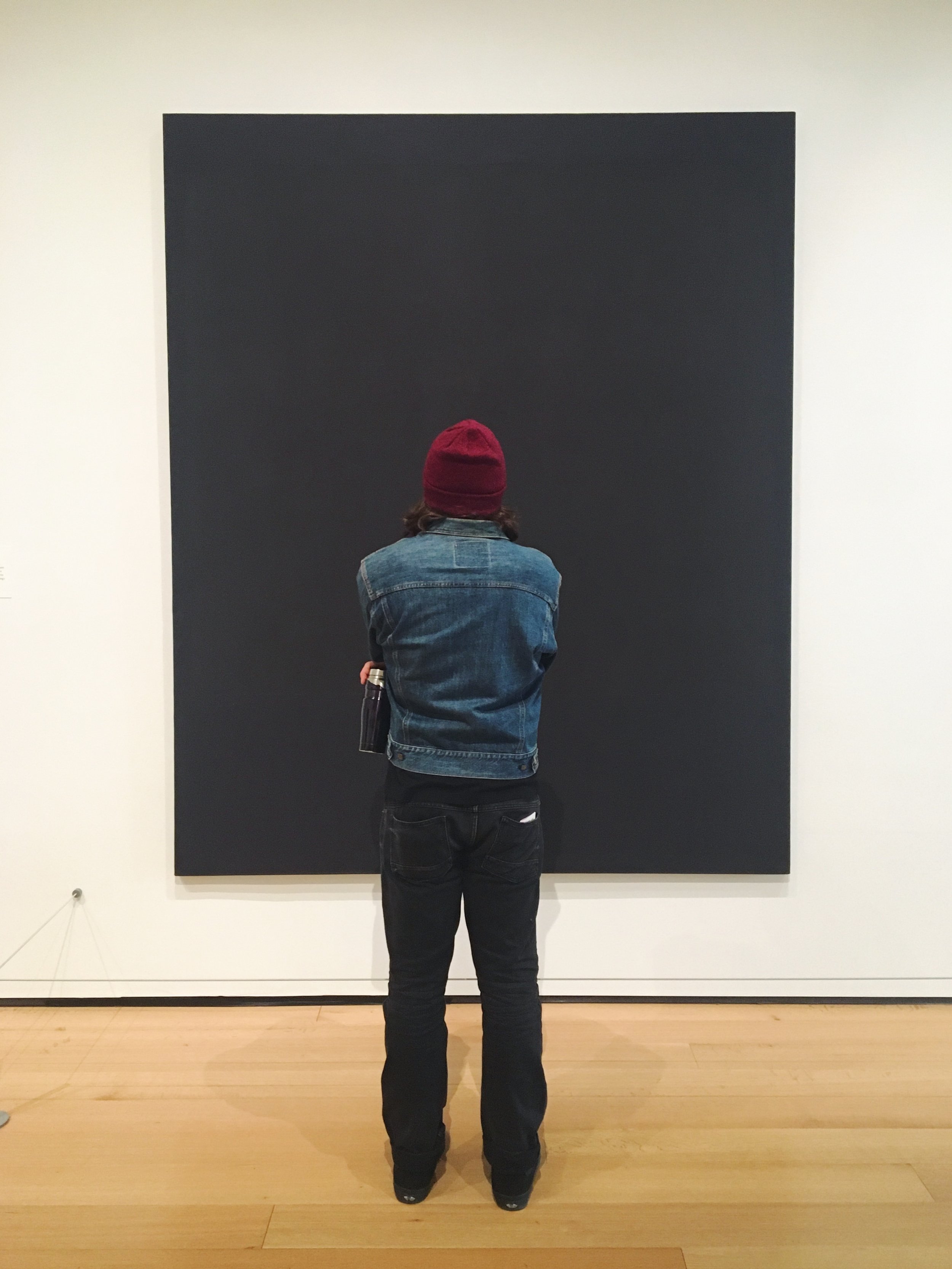
Lastly, in No.8 (1964), the wall text emphasizes how:
“Rothko’s black paintings are often discussed in terms of the artist’s own struggles with illness and depression. But in the visible spectrum, black is the absorption of all colors - look closely here for the variations in tone and hue across the painting’s dark surface.” (MFA Wall Text)
Here, more so than in any of the other works on display, Rothko forces viewers to immerse themselves in close looking - for with just a cursory glance, they might miss the subtle differences in the black paints used.
No. 8 (1964)
In my brief time at the MFA, I was able to witness, firsthand, how people’s experiences of Rothko’s differ. Some people scrutinize with close looking. Some people sit and contemplate. And some people stand, get consumed by the canvas, and cry. The emotions of the viewer, thus mirror the emotions imbued in the canvas - in Rothko’s case, with color.
No. 10 (1949)
Xx, Maia

