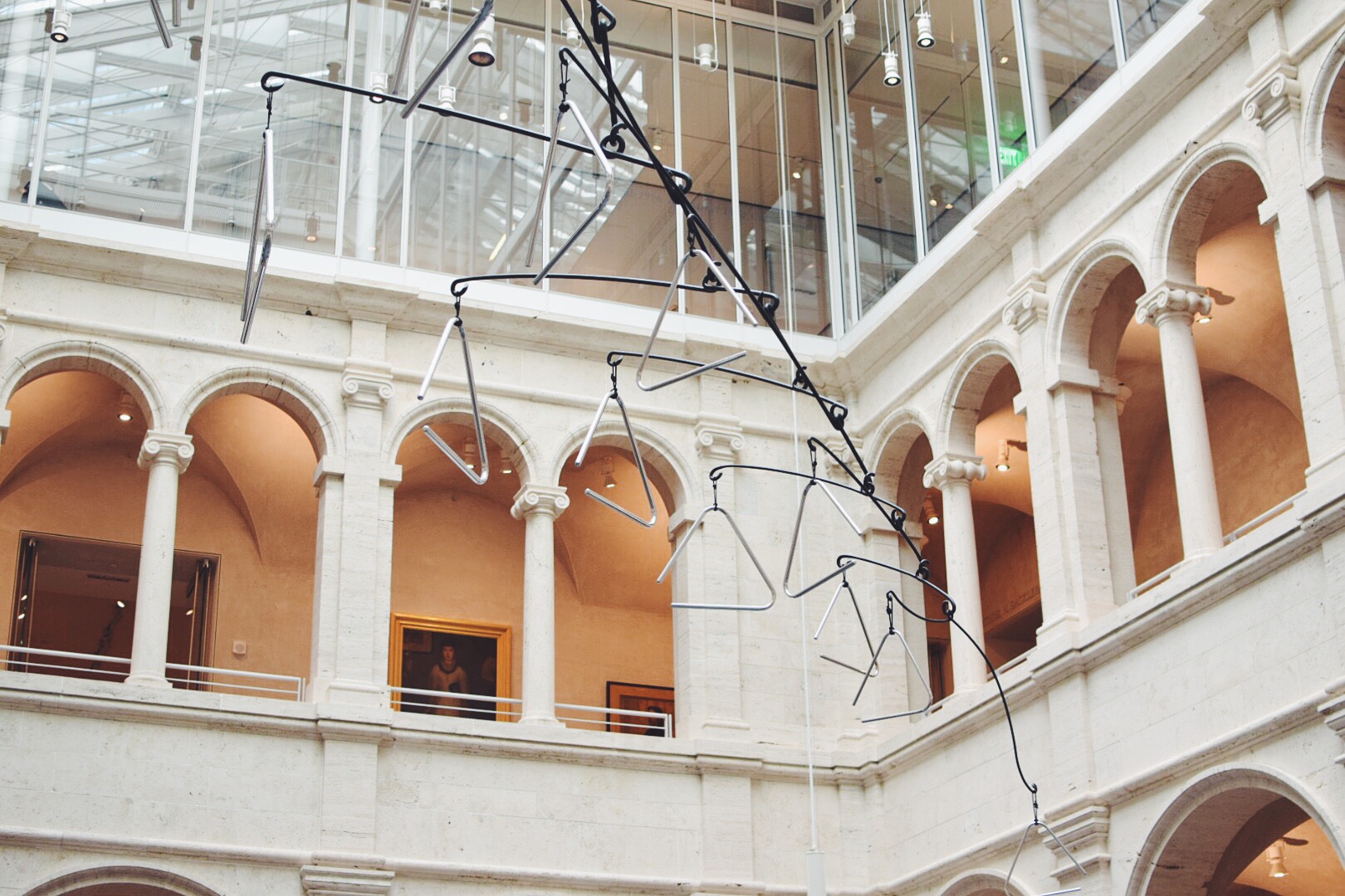
Saturdays are for Day Trips to The Portland Museum of Art


Going to school in Cambridge, MA means I'm extremely close to Portland, ME - a quaint area known for a burgeoning art scene and the ease of weekend trip-ability. This past Saturday, courtesy of the Harvard Art Museums Student Board & Student Guide program, my friends and I took a bus to check out all the fuss for ourselves. 

Given that the semester is coming to a close and that senior spring nostalgia is hitting (despite the fact that I'm a junior and fully have another school year ahead of me), escaping campus provided unexpected relief from some self-imposed woes. It took exploring the Portland Museum of Art to make me feel at home, in a city I had never visited before. And to catalyze that comfort, I have Joan Miró to thank. 

After scoping out the Biennial Show in which I found photographs by John Harlow who spliced his imagery with his wife's journal entries, Anne Buckwater's innovative mounting method for her paper works, and Becca Albee's intriguing commentary on feminist literature by condensing her annotations per chapter on one page, I peeled away from my peers and travelled upstairs. 

John Harlow, Garish Sunlight, 2016

Anne Buckwalter, The Republic of Hysteria, 2017

Becca Albee, RADICAL FEMINIST THERAPY: Working in the Context of Violence, 2016

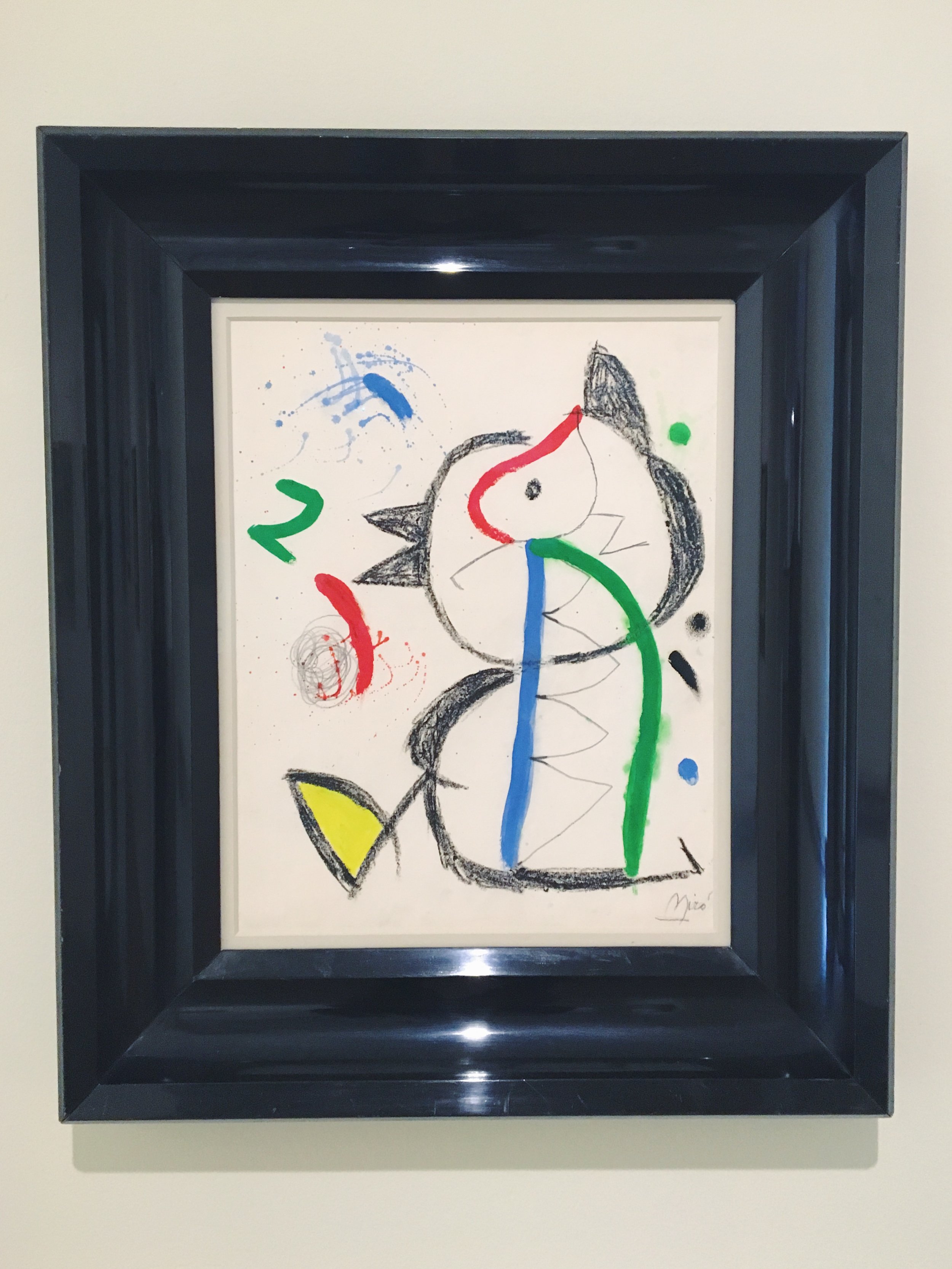
Seeking fresh air and a moment of silence, I found myself face to face with a time machine. No, not actually. But I stumbled upon a Miró I had never seen before. But the gestural and jovial marks familiar to this artist transported me to my grandmother's apartment circa 2003. I'm sitting in her kitchenette eating turkey and butter sandwiches on challah rolls, and laughing at something my sister said that my grandmother must not have found as amusing. While I'm no longer 6 years old nor in my grandmother's Miami Beach apartment, standing in front of this Miró provided me a momentary glimpse into my past. 

Joan Miró, Untitled, circa 1981

This is what I love about art: it's ability to transport and to resonate. Art has a way of making you feel something, and allowing you to see in abstraction what you're looking for. And what I was looking for, in that moment, was comfort. And comfort I found in this untitled "chickadee" looking work. 

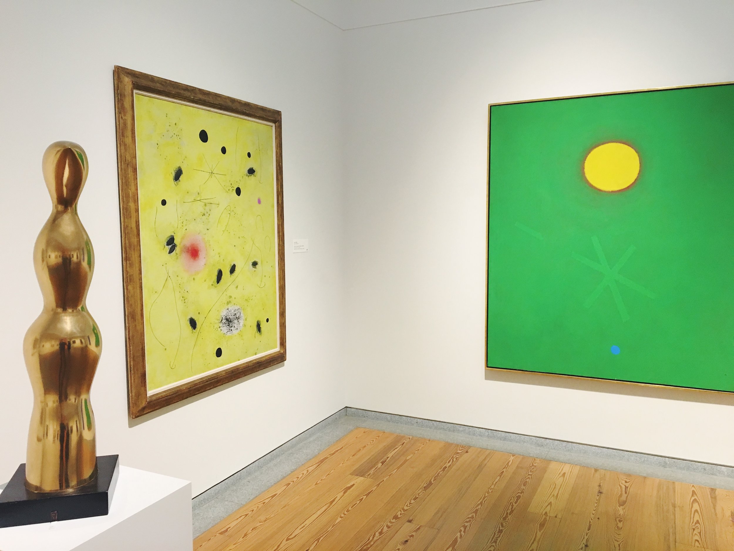
(left) Joan Miró, The First Spark of Day III, 1966 

(right) Adolph Gottlieb, Green Ground, 1968

In another room on a different floor, I encountered a corner that instantly made me smile. Perhaps it was the brighter colors to contrast my somber mood, but I also found it shocking that the painting that most moved me was another Miró. This one, entitled The First Spark of Day III simply made me happy. And having it juxtaposed with Adolph Gottlieb's Green Ground created an instant happy place (or corner, at that) for me in the museum. 

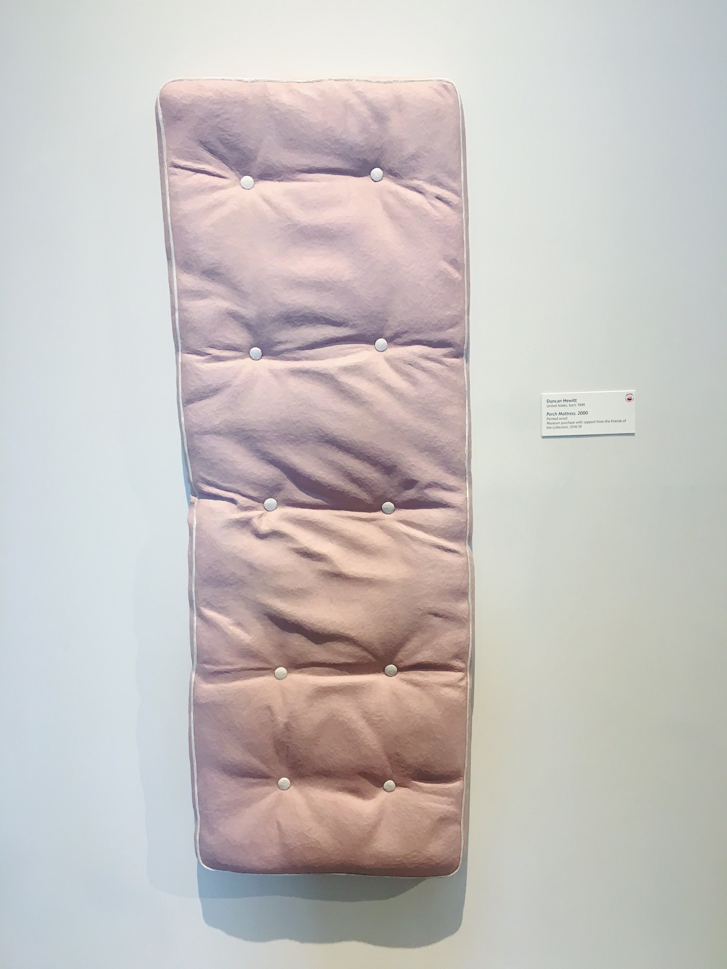
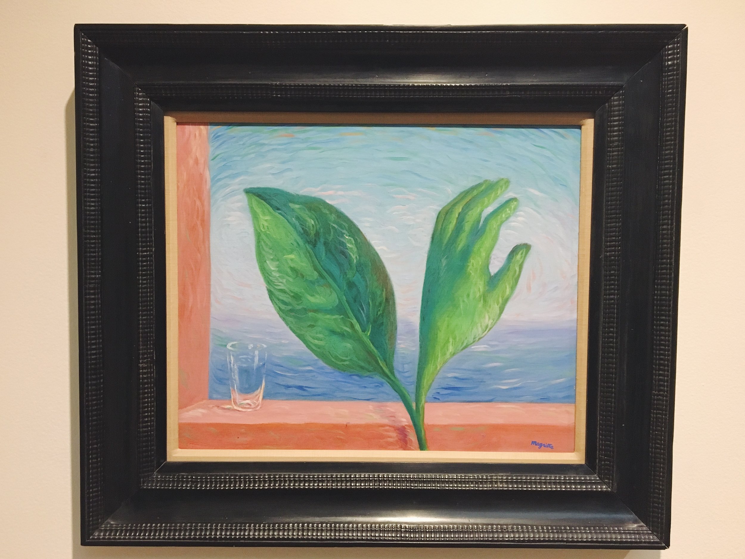
Other works in the museum were less heart striking, but I still enjoyed encountering new artists and new mediums. Like this Porch Mattress by Duncan Hewitt - it's made entirely of painted wood! Or this René Magritte painting that had me doing a double take at first, before I noticed the slight of hand ;) 

Duncan Hewitt, Porch Mattress, 2000

René Magritte, The Tempest, circa 1944

So I'd say that the two hour bus ride to Portland was well worth it, given that it brought me instantly closer to home - and that trip is usually a 3 hour flight. 

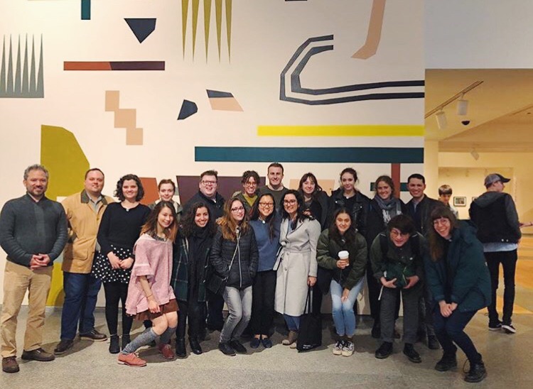
The Harvard Art Museums Student Board & Student Guide Program, 2018. Courtesy of @harvardarthappens. 

Xx, Maia 
 

How Emotionally Resonant are Rothko's, Really?


If you know me (or have kept up with recent posts), you know how intrigued I am by color. So much so, I'm probably writing my senior thesis about it. I'm particularly curious about how different uses of color in art can accelerate emotional connectivity and convey artist's messages in a more experiential way. As an intangible element of art, color has several characteristics that come into play when discussing how it affects viewers.

Unlike some other more upbeat and whimsical employments of color, Mark Rothko explores the darker side of color's capabilities. "Darker” not only represents the harsher tones and somber affect present in the works of Mark Rothko, but also how the content dealt with in his work tends to be heavier, his execution more rough and visceral, and his desired message to convey is more desperate.

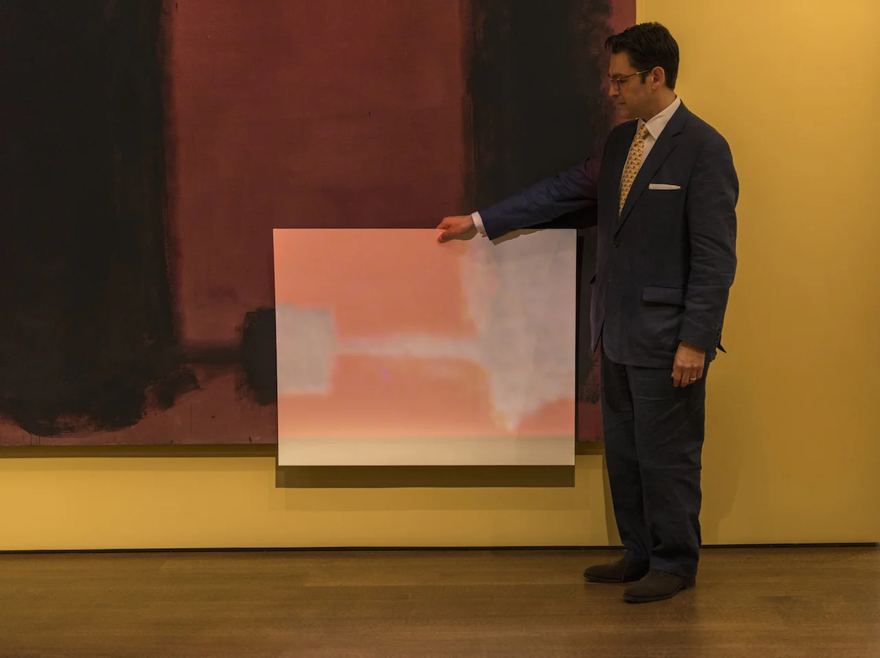
Mark Rothko was an Abstract Expressionist working in the 1940’s-70’s, painting massive color field canvases to expel the tension and despair he dealt with throughout his life. After being diagnosed with a mild aortic aneurysm, Rothko began using materials that reflected the instability of his condition. Therefore, his paintings tend to degrade at a quick rate, and have been subjected to various conservation techniques; most excitingly that of the Harvard Art Museums in 2015 who projected corrective light on the canvas to restore their original appearance.

Photo courtesy Peter Vanderwarker

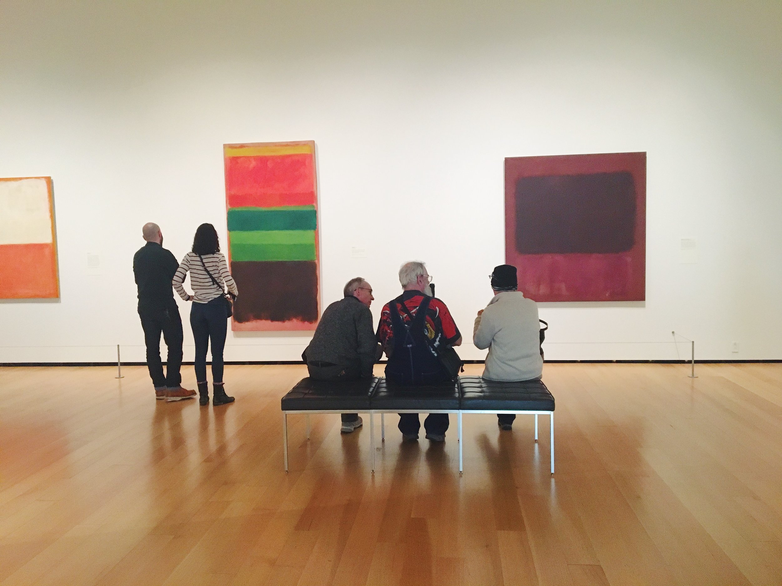
Looking at several of his canvases on display at the MFA, it’s interesting to pick apart the elements of his works that contribute to the particular feeling of experiencing them in person. Taking into consideration materials, size, and color palette, we can begin to understand what’s at play in a Rothko painting.

Rothko himself described his works as transcendent. Evidenced in No.9 (1948), a more jovial painting in color scheme, the colors act an actionable agents.

“I think of my pictures as dramas; the shapes in the pictures are the performers. They have been created from the need for a group of actors who are able to move dramatically without embarrassment and execute gestures without shame.”

(Mark Rothko quoted in MFA Wall Text)

No. 9 (1948)

This canvas depicts movement and the vibration of layered swatches. The colors, here, pulsate, perhaps due to the technique of watering down some of his pigments to allow for transparency in layering.

In Untitled (1949), Rothko starts to move towards a darker palette familiar to his “classic style.” Here, the colors struck me more personally, instantly eliciting a nostalgic memory of eating rainbow cookies in my childhood. Thus, the canvas managed to depict the colors of my heritage and helped me connect in an overtly symbolic manner.

By No.1 (1961), Rothko employed darker colors described in the wall text as, “the artist contrasts two muted green rectangles with a third, smaller shape of fiery red, all set against a somber maroon ground.” (MFA Wall Text) Notice how the descriptors of the colors are all emotive: "muted," "fiery," "somber."

No. 1 (1961)

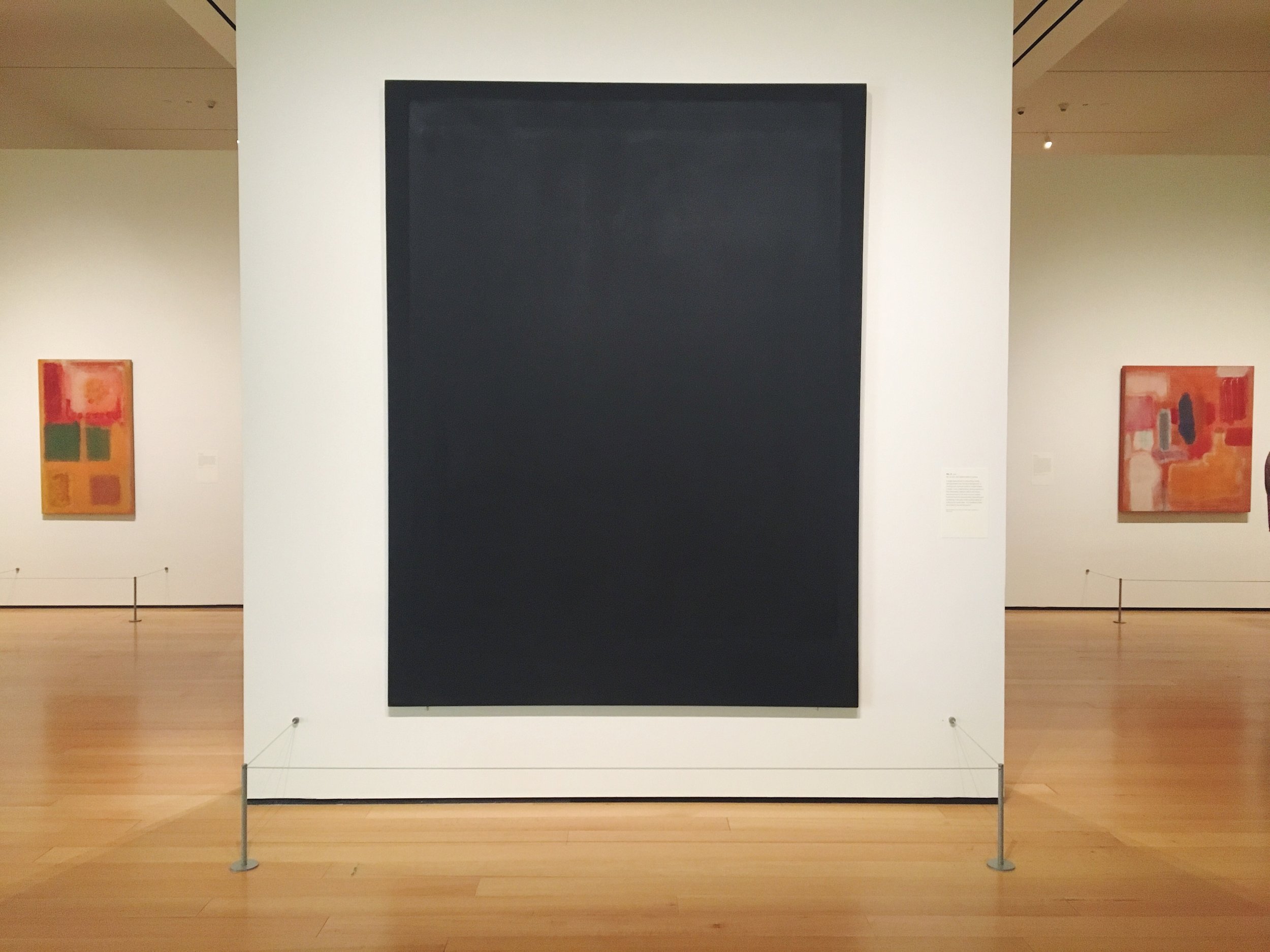
Lastly, in No.8 (1964), the wall text emphasizes how:

Rothko’s black paintings are often discussed in terms of the artist’s own struggles with illness and depression. But in the visible spectrum, black is the absorption of all colors - look closely here for the variations in tone and hue across the painting’s dark surface.” (MFA Wall Text)

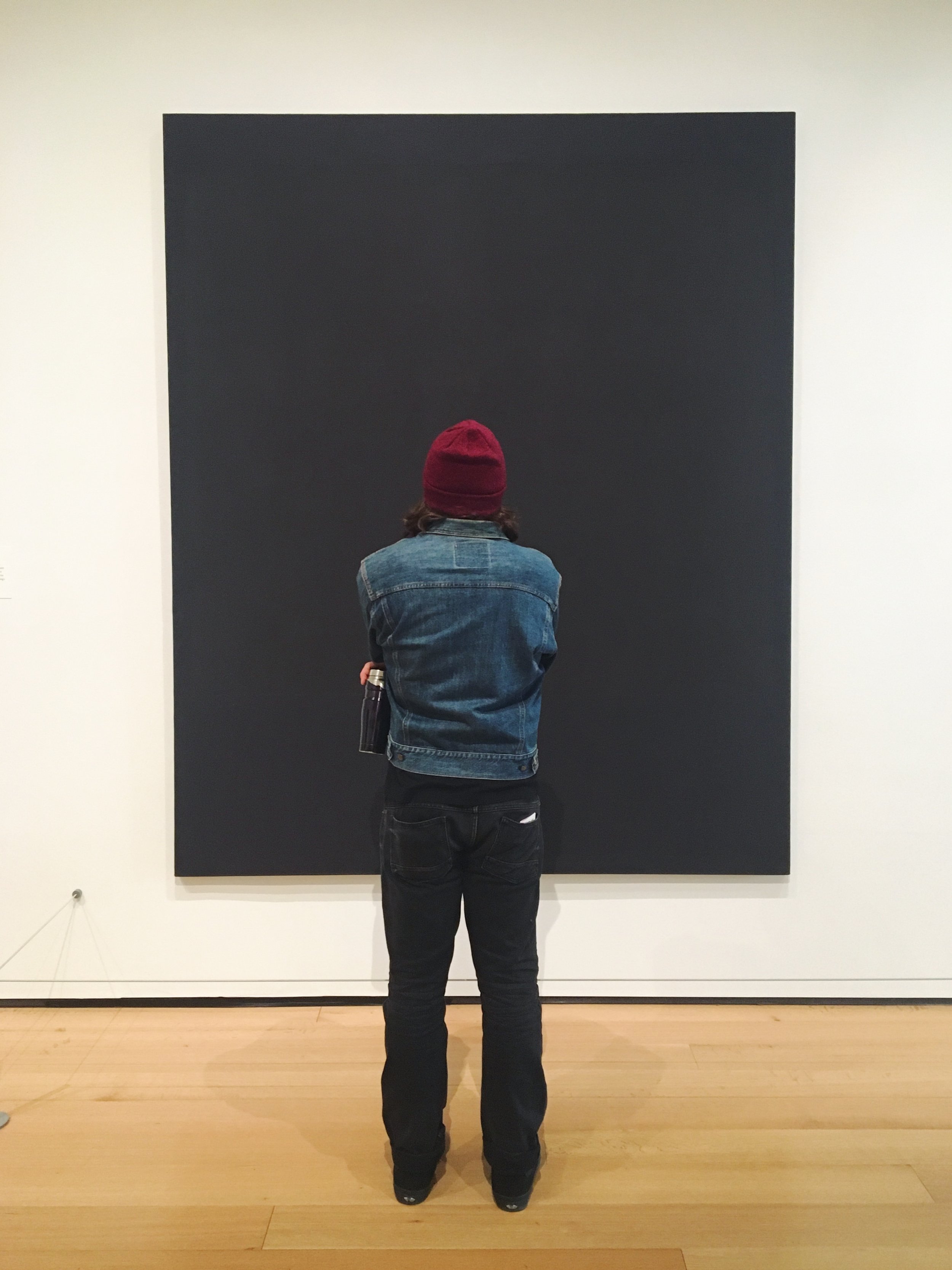
Here, more so than in any of the other works on display, Rothko forces viewers to immerse themselves in close looking - for with just a cursory glance, they might miss the subtle differences in the black paints used.

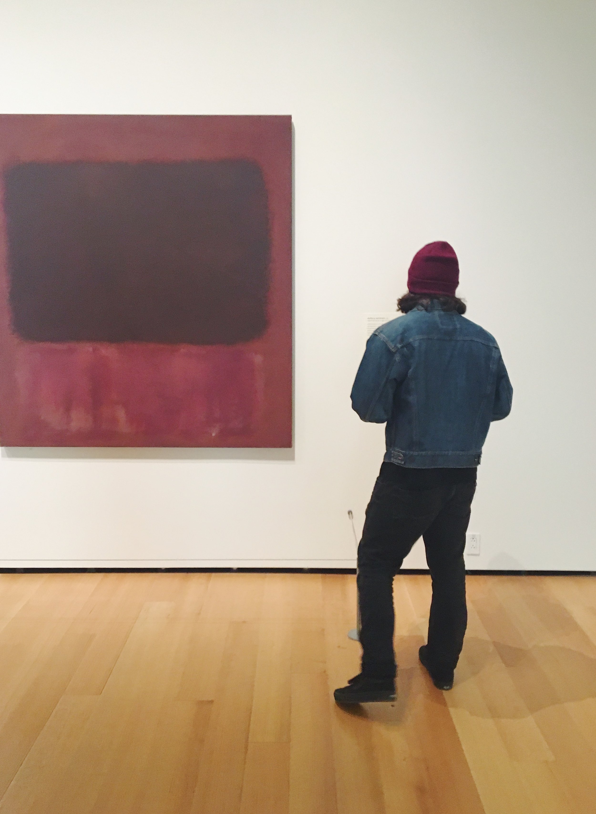
No. 8 (1964)

In my brief time at the MFA, I was able to witness, firsthand, how people’s experiences of Rothko’s differ. Some people scrutinize with close looking. Some people sit and contemplate. And some people stand, get consumed by the canvas, and cry. The emotions of the viewer, thus mirror the emotions imbued in the canvas - in Rothko’s case, with color. 

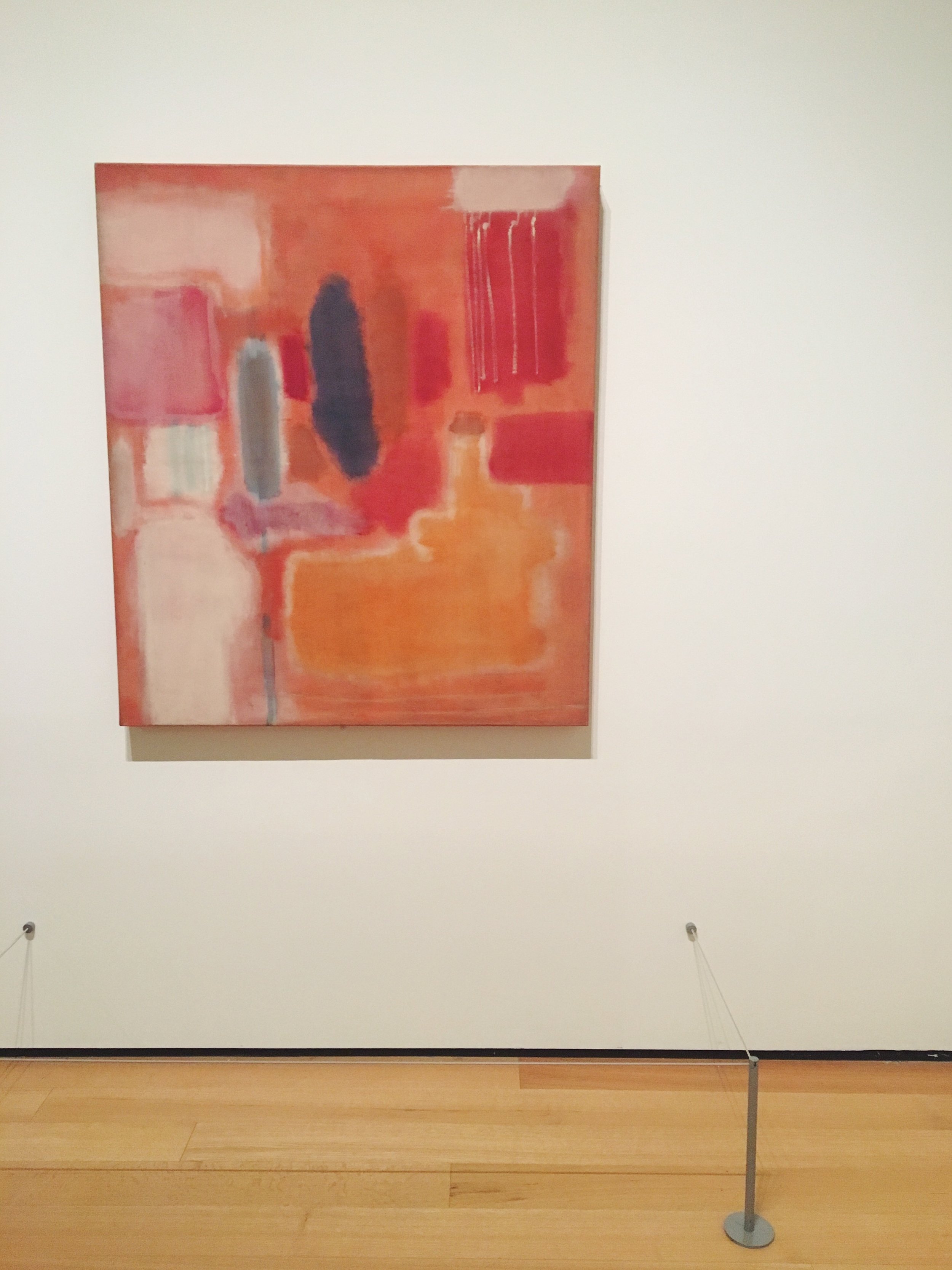
No. 10 (1949)

Xx, Maia
 

Artsy April: Return to Identities


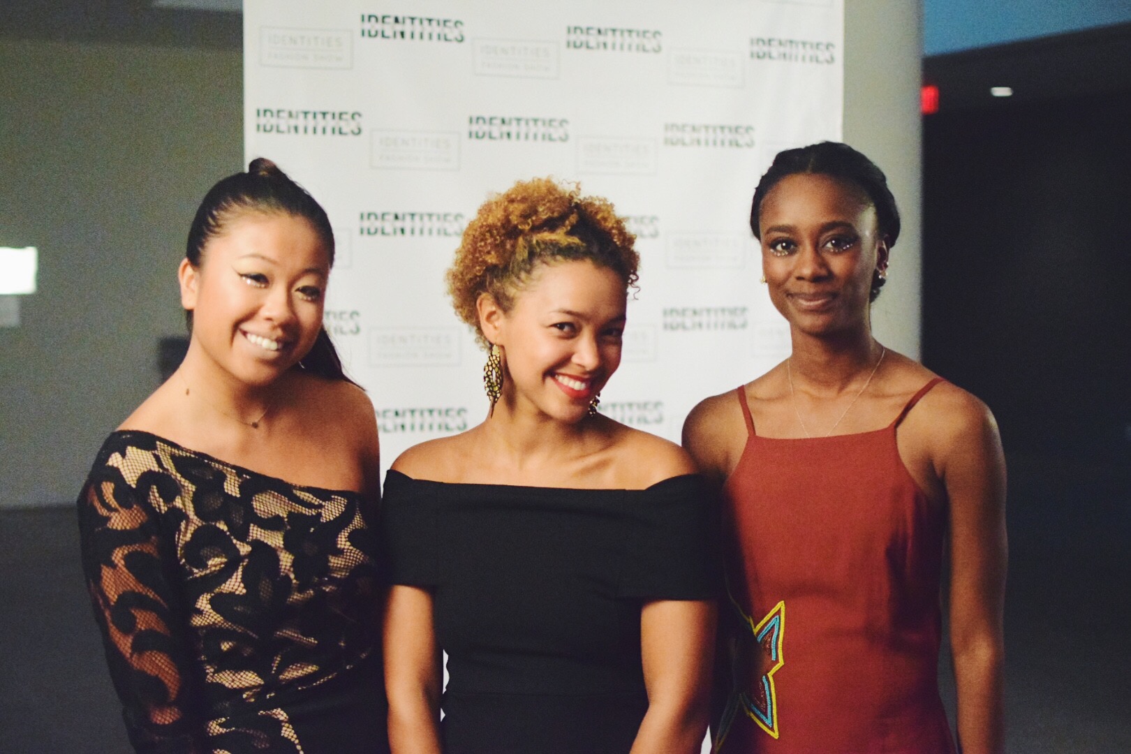
It's been a year since I first attended Identities behind a lens and in front of the stage. This year (watch the footage here!), I tried my hand on the stage itself, taking some action shots as time permitted and the music moved me. 

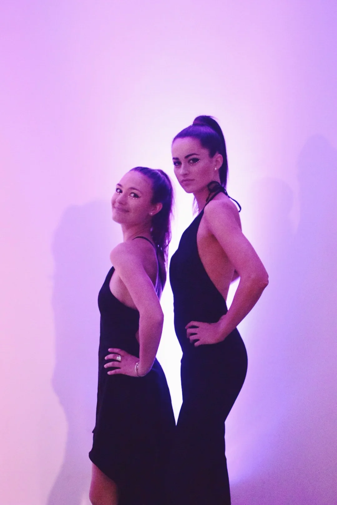
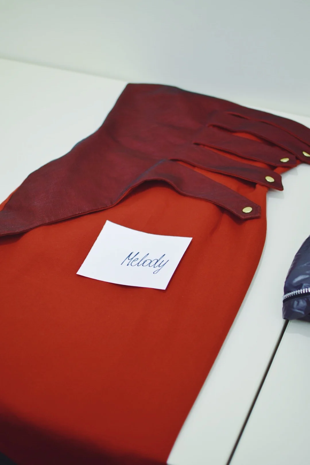
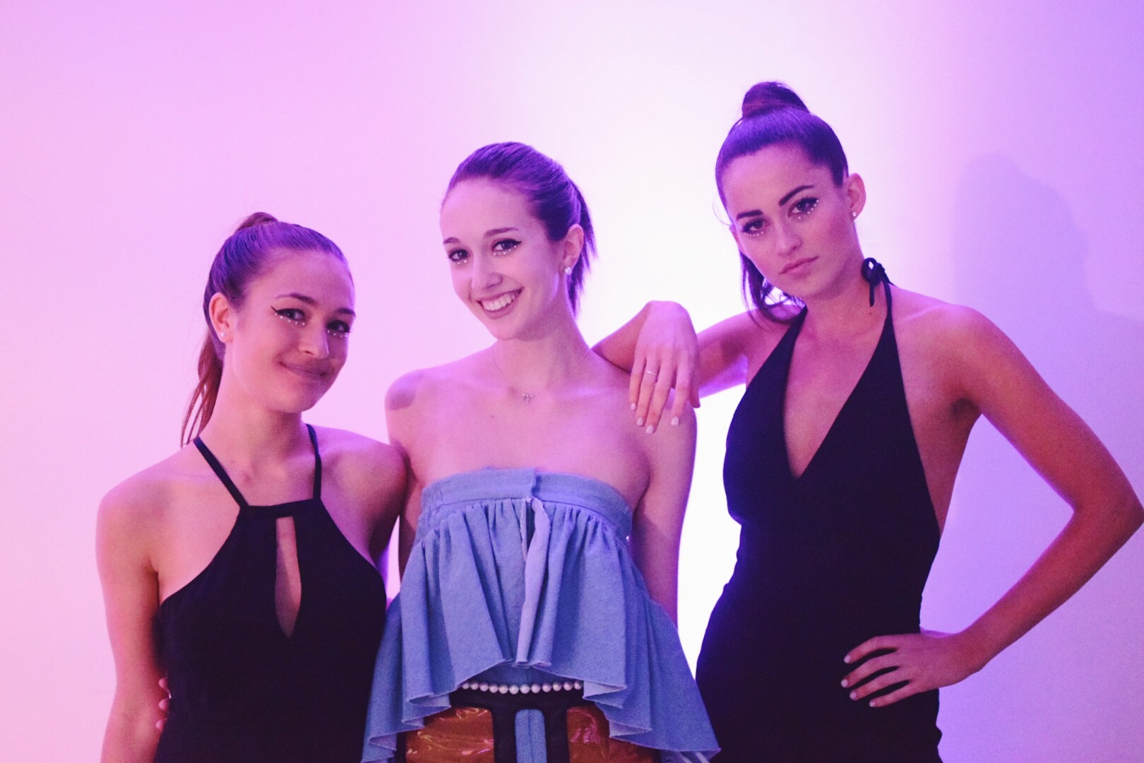
Identities, a campus-wide fashion show focusing on inclusion and displaying clothing in this year's theme of Fashion & Technology, provided a day full of meeting new pals, strutting our stuff, and twirling around in the designer garbs we were given. 

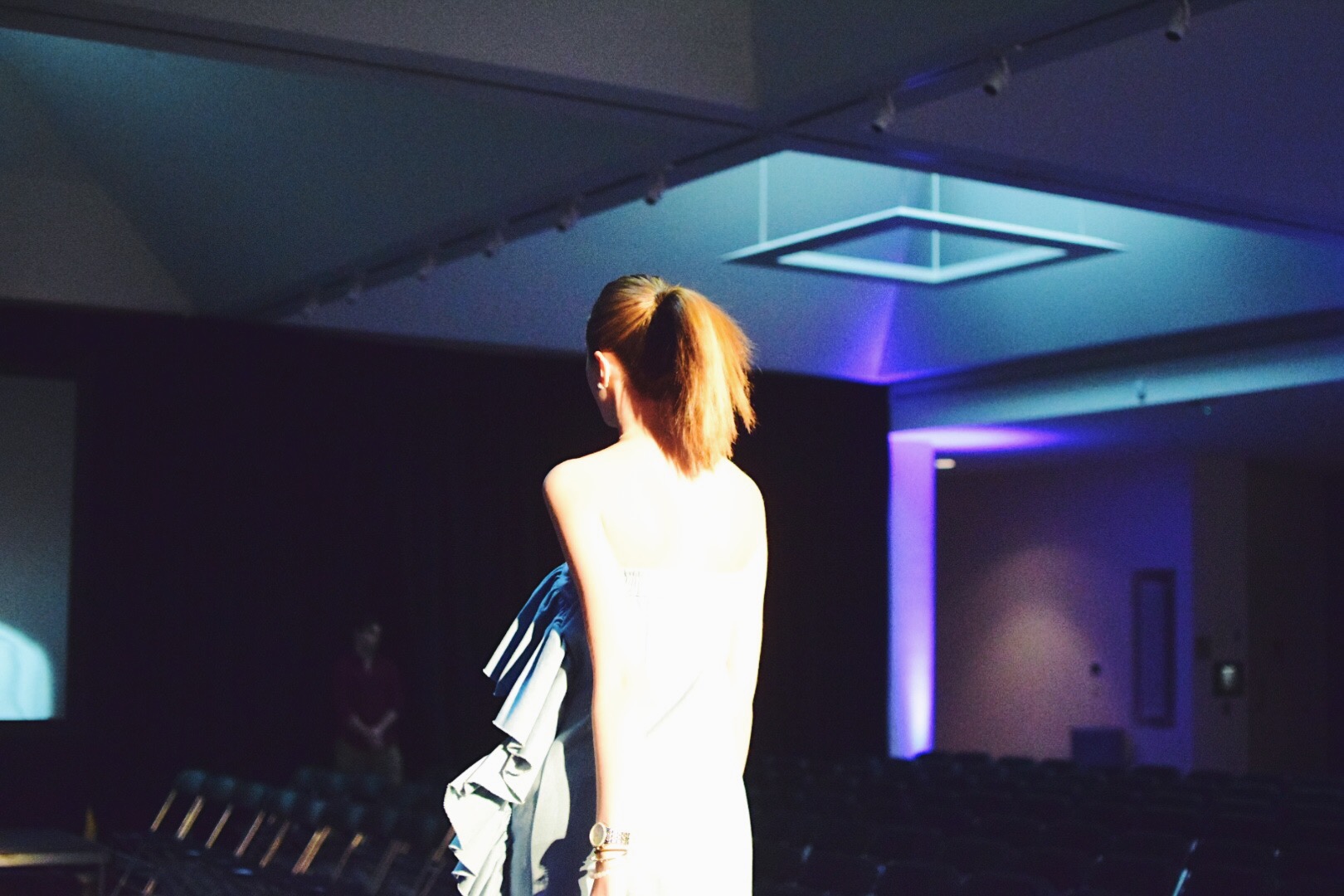
Though modeling in the show was more my priority than photographing it, I stole away for a few moments to capture the awe and allure that would enrapture the audience later that night. Though, caveat: these are only a fraction of the stunning models, as I was restricted to photographing those around me who happened to be on my same snack/dance break schedule. 

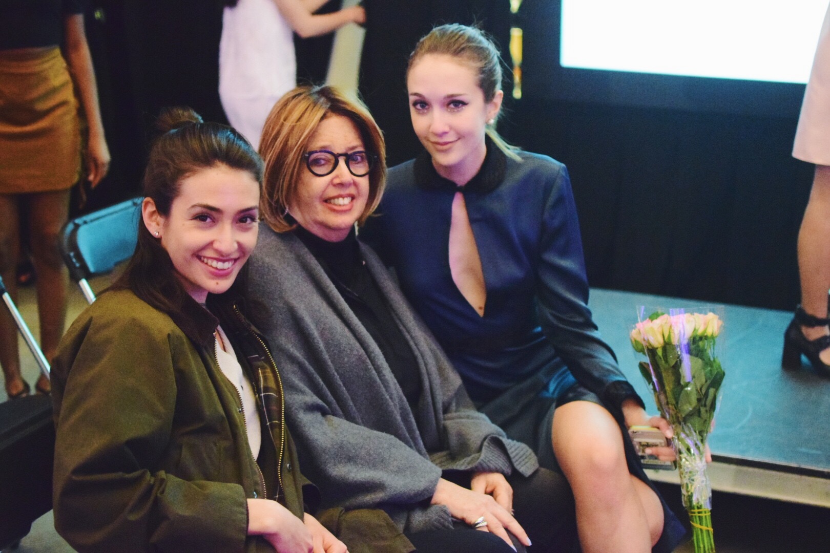
This Identities show was particularly special to me because my family flew up for the occasion (having the chance to check out one of my Admissions Info Sessions and Crimson Key tours while they were up here), and it was the dose of home that I needed to finish out the semester. 

Peep shoes by Thesis Couture (importing Nasa technology to comfy footwear!) & some of the more tech inspired looks: 

So thank you, Identities, for an excuse to get gussied up, see my family, and feel the electricity emanating from the bumpin' tunes and cheers from the faceless audience (those spotlights were BRIGHT!) <3

Xx, Maia 
All photos by me, except me lacing up my Thesis heels (Photographed by Olivia Nie)


Artsy April: Student Spotlight


In keeping in this month's #arstyApril theme, today's post features an art installation constructed on campus by student, friend, dancer, lover of live, and all around gem, Bruno! Today's high of 70's and sunny sunshine have students crawling out of the library woodworks to chill in the yard, lounge on the HAM steps (ode to G.G.), and enjoy all the art that surrounds them - especially those created by their peers!

This work, while sadly no longer displayed (yes, catch me featuring unseeable art, sorry) hung in the Carpenter Center on campus last semester. I photographed the work for Bruno in an attempt to preserve the movement and functionality of the piece before it got torn down (haha, because it's made mostly of fabric). Anyway, here's the low down, straight from the artist's mind and pen:

“I slipped” (or at least that was the title a couple months ago) is a three-dimensional representation of a two-dimensional recording of movement. After working with charcoal drawings that documented dance, I decided to reiterate one of those drawings in three-dimensional form.

This is the fifth iteration of it—wood, iron, resin, wire, and plastic were all involved at one point or another, but they were not the right materials. The skeleton is made by a couple pieces of hand-bent steel that were welded together. The leg at the bottom is a plaster cast of my own the was cracked in half and glued back together, and I used dyed chiffon as the body of the sculpture. It hangs from a single point and the fabric flows freely except for the anchor points, which means that light touch and wind can make it move and spin. The sculpture dances.

What I enjoy most about it is its asymmetry, given that it is the result of what is supposed to be a symmetrical movement. The leg cast is en pointe which alludes to dance, and the flowing fabric wrapping around the cast as the piece spins creates a sense of freedom and movement which comes with dance but is recreated with inactive materials in this case.

I see people interacting with it by gently touching or pushing it around, although my friends have been reluctant to do so at first. I guess looking at it is nice too. As a VES concentrator, I was lucky to continue my research of bodily movement and its reverberations through different materials as part of classwork. It was a fulfilling project and I’m excited about future exploration and potential collaborations with other media!

Having been able to interact with the work myself, I felt seamlessly (another fabric pun) connected to Bruno's unique movement, while also able to inject the movement of my own body interacting with the work. The wire is surprisingly heavy, and pushing my weight against it reminded me of the juxtaposition of the weightlessness and immense effort of dance. Kudos, Bruno on this stellar piece! Now put down your phone or your computer and enjoy the freshness of the day outside! 

Xx, Maia
 

Artsy April: Materiality of Mourning


It's April (the third to be exact) and finally feeling like Spring with this post-snow storm heatwave! And though this past weekend had less than favorable weather conditions, the campus didn't slow down, nor did the traction of students and guests to the Harvard Art Museums and the Student Art Show skip a beat! In honor of that, the immense time I spend in HAM (not the meat, but the museum for short), and the fact that I'm realizing art, which are half of my studies, truly make me happy, I'm self-proclaiming a month long holiday: Artsy April! Let this be a month of eyes attuned to the aesthetic and an overall appreciation for anything artistic - including gloves found on the floor (I'm looking at you Bruno, @fallinginglove). 

This month, you'll see posts about current exhibits, student-artist-friends-extroardinaire, Instagram geniuses, and more! So let's inaugurate this initiative with an exhibition currently on display at HAM that is near and dear to me, for a counter intuitive reason:

I'm referring to the Doris Salcedo Exhibit The Materiality of Mourning. (3rd floor of HAM, check it out, check it out!)

I'm no stranger to this exhibit. Rather, I had actually seen it on display at the Perez Art Museum of Miami last summer, before it travelled up to Boston. I remember going to PAMM, expecting to see some brightly colored anything (typical of happy, Miami summertime), and being confronted with the ghostly muted tones of these works - an initial reaction given my love for color. As personal background, I visited this exhibit in Miami during the time in which I was deciding to study computer science or art history (before the combination of doing both struck me), and pitching to my parents why I thought art history would be the path for me. I remember coming home that day, kind of disappointed with what I had seen, and sitting down to talk to my parents to quasi "pitch" them my plan of study. 

Naturally, my parents asked about my day, and honed in on the fact that I didn't "like" what I had seen at the museum. They pointed out that I'm not going to "like" (what I define to be visually pleasing) all the art I encounter, but that shouldn't mean I should shy away from it. Rather, I should dive into why it affronts me, and learn more. I left Miami shortly thereafter, kind of defeated that maybe art history wasn't the way for me. (Important note: I'm a fan of wall text, I know it's controversial as in "should art speak for itself? Or does it really need an explanation?" But I find value in the words written to supplement the works, not substitute them, and realized I hadn't given the Salcedo exhibit enough opportunity to learn and read about it to understand and appreciate it).

Fast forward to Sophomore fall, I'm about to declare my joint plan of study, I start working at the Harvard Art Museums as a member of the Student Board, and I'm told The Materiality of Mourning will be exhibited at our very own museum! I thought, "This is my chance to prove to myself that I can 'like' something that I don't initially gravitate towards, merely if it be only for the thought process and artistic merit." 

This is when I was presented with the opportunity for a pre-opening night walk through with the curator, Mary Schneider Enriquez, a personal friend of Doris Salcedo. I cannot even begin to explain how my eyes opened, my heart opened, and my entire being accepted this exhibit - and I knew, that this was the right path of study for me. 

With all of that personal significance aside, the exhibit itself is quite incredible. It's incredible in a very hallowing and moving way, given that it deals with death, violence, and quite literally, the materials of mourning. As a viewer, you're presented with four major works: toppled over armoires physically conjoined with tables, mutilated chairs, a fabric of sutured roses, and a series of three vapor-like "shirts". Each work calls attention to violence, in Colombia and Detroit for example, by comparing mutilation of common, often household objects, to the aggression against people. 

Untitled 2008 displays two items of familiar furniture, a table and an armoire, and forces them together in an unnaturally chilling way. The table being just long enough to fit a body, the cement filled in like a grave. 

Thou-less presents a series of chairs that are crushed, reformed, and otherwise butchered. The chairs evoke spaces in which bodies once occupied - which I conceptually understood, but felt in practice now every time I leave a classroom, and an imprint of the student body is left on the disarray of chairs. 

A Flor de Piel is probably the most intricate, materially, as it verbally translates to skin of flowers, and it evokes the softness of a bedroom sheet yet with the colors of blood and death, physically made from dyed roses sewn together with suture thread - like the sealing of wounds. Here, Salcedo points out that violence can even occur in the sanctuary of your own room.

Disremembered is a series of shirts that are made of nickel dyed needles and silk thread. The overall form is meant to signify the casual act of hanging up a shirt or jacket at the end of the day when you get home. It also alludes to the presence of a person's body that would normally be in the shirt, but now all that's left is a hollow artifact of the person who is gone. The needles elicit the "pins and needles" feeling that crawls on the skin of those mourning. 

At the risk of not doing the exhibit enough justice with my cursory explanations (nor seeking to turn this blogpost into a robust paper for one of my art history courses), I felt that this portion of the exhibit catalogue succinctly encapsulated the works:

In Disremembered, Salcedo continues her pursuit of a materiality that is all but fleeting. Like a Flor de Piel, the sculptures in this series seem to be just on the verge of disappearing, although these works are not constructed of organic materials. Each is a seemingly fragile, specter-like form of human scale that appears to float against the wall. 

Moral of the story, please check out this exhibit for yourself! I only hope you take more time than I originally did to truly fathom the brilliance underpinning these works, and let yourself feel the desperation and sense of mourning that is evoked. 

Other moral of the story, taking this month to post about different arts will hopefully bring to all of your attentions the wonderful, artistic opportunities that surround us daily. So go forth, my friends, and find your art! I suggest stopping at Jenny's Cafe in HAM on your way ;)

Xx, Maia & the first installation of #artsyApril